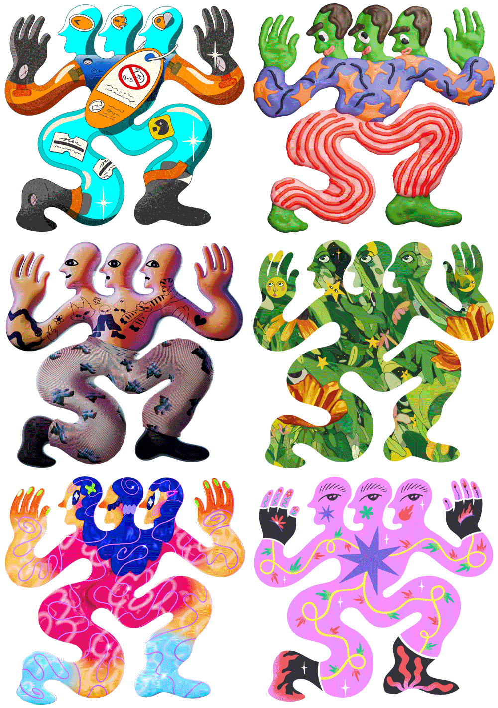
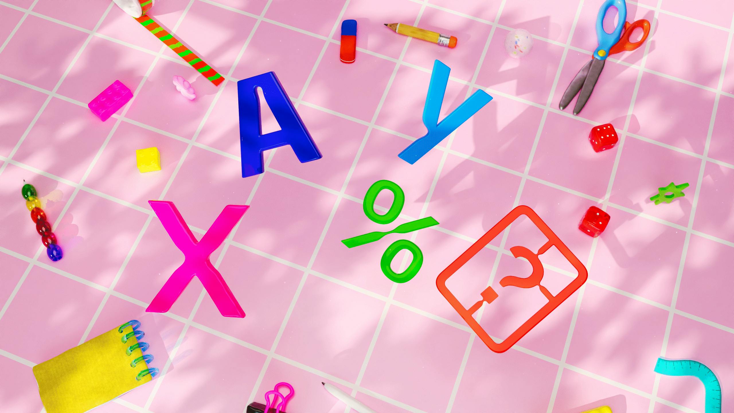
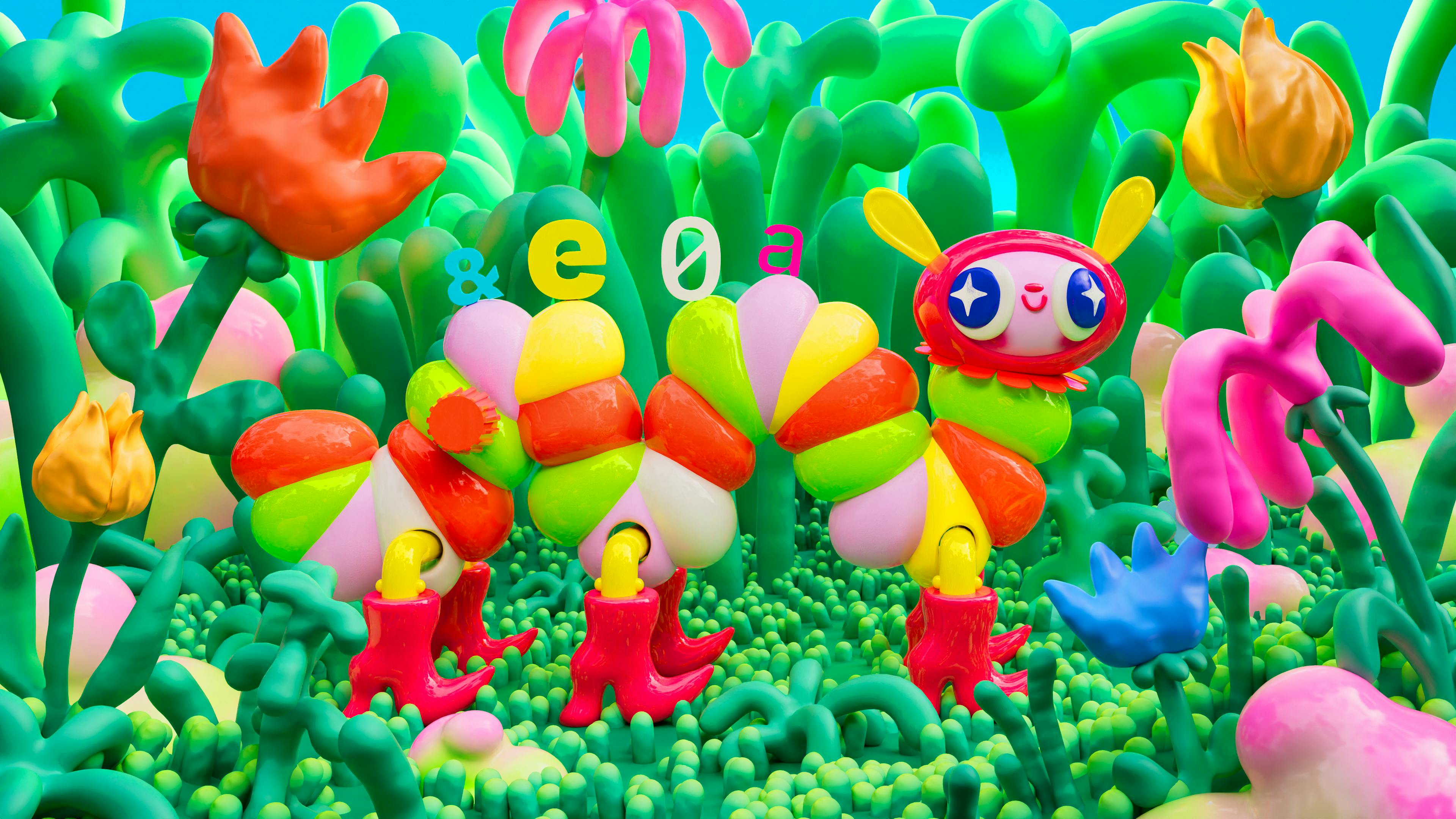
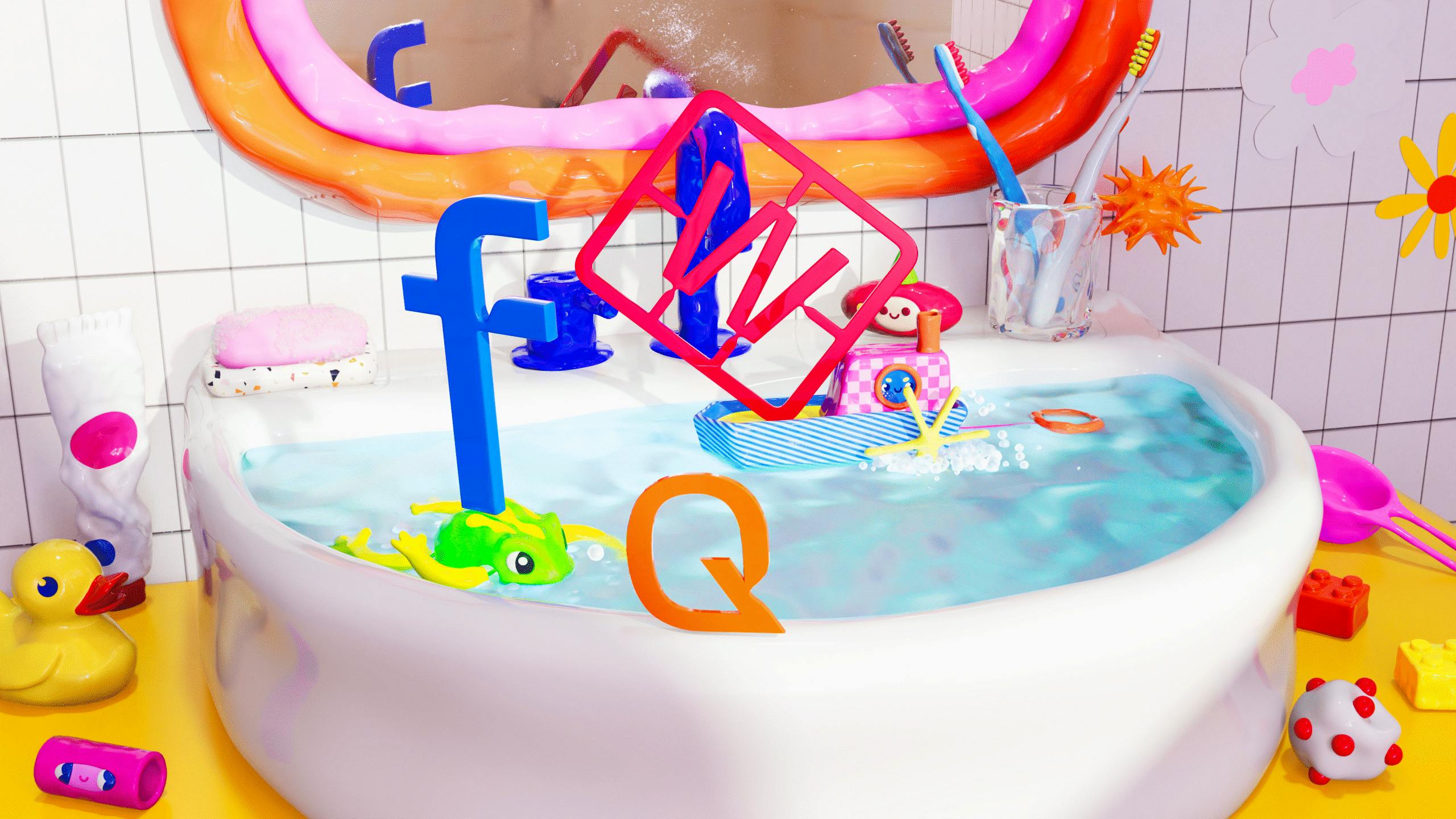
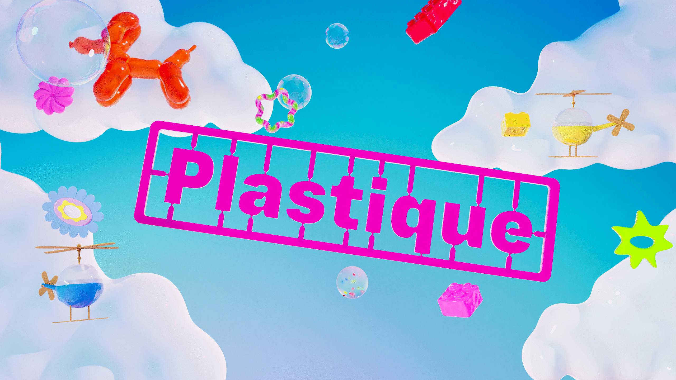
From the weird to the whimsical, Aleks Bokova creates worlds brimming with wonder – and Kilotype wanted one for its brand new typeface
For Aleks, Plastique was more than just a font. It was another chance to prove the power of personification. It was about bringing a brand to life, infusing its product with personality and designing a world entirely of its own.
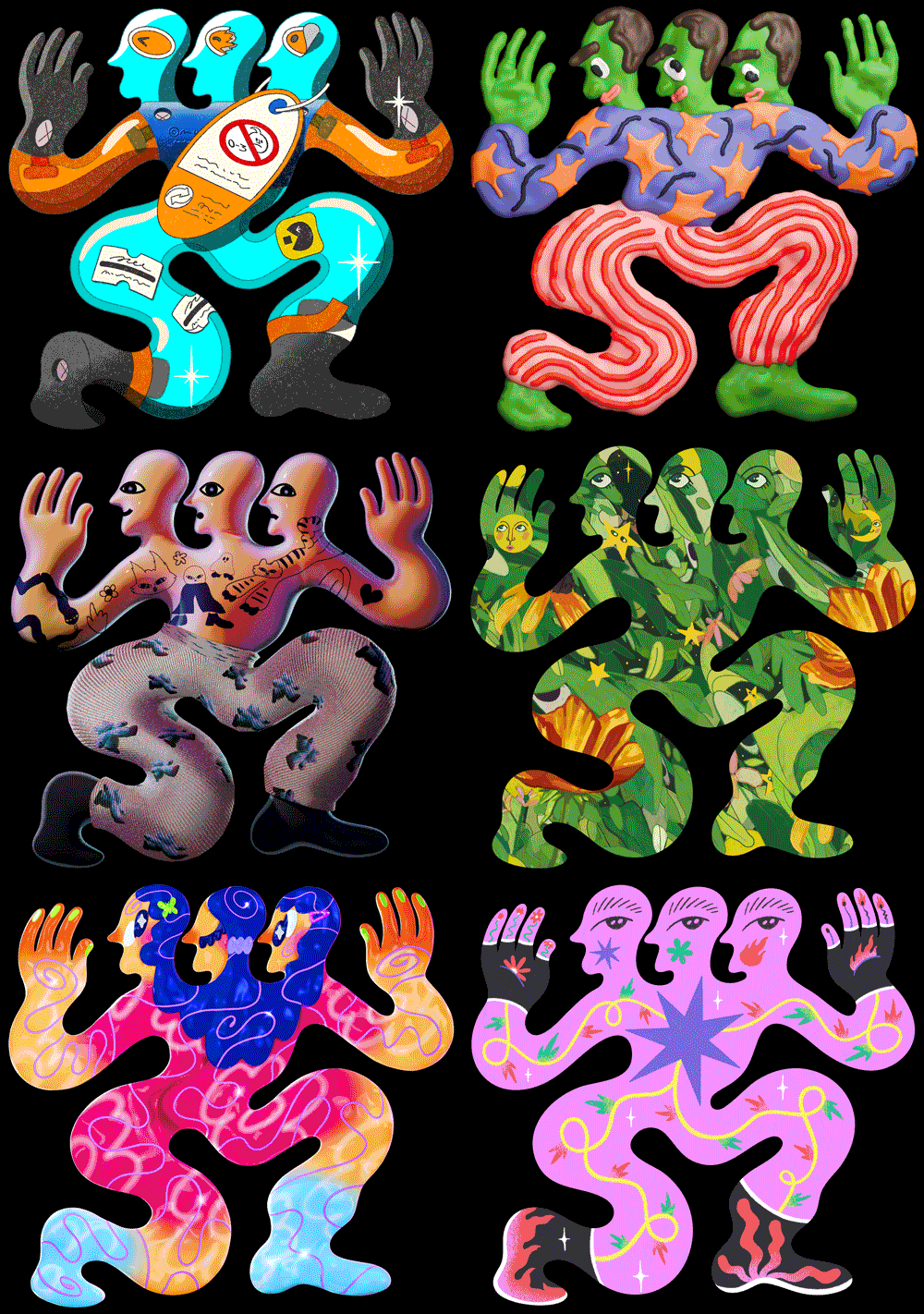
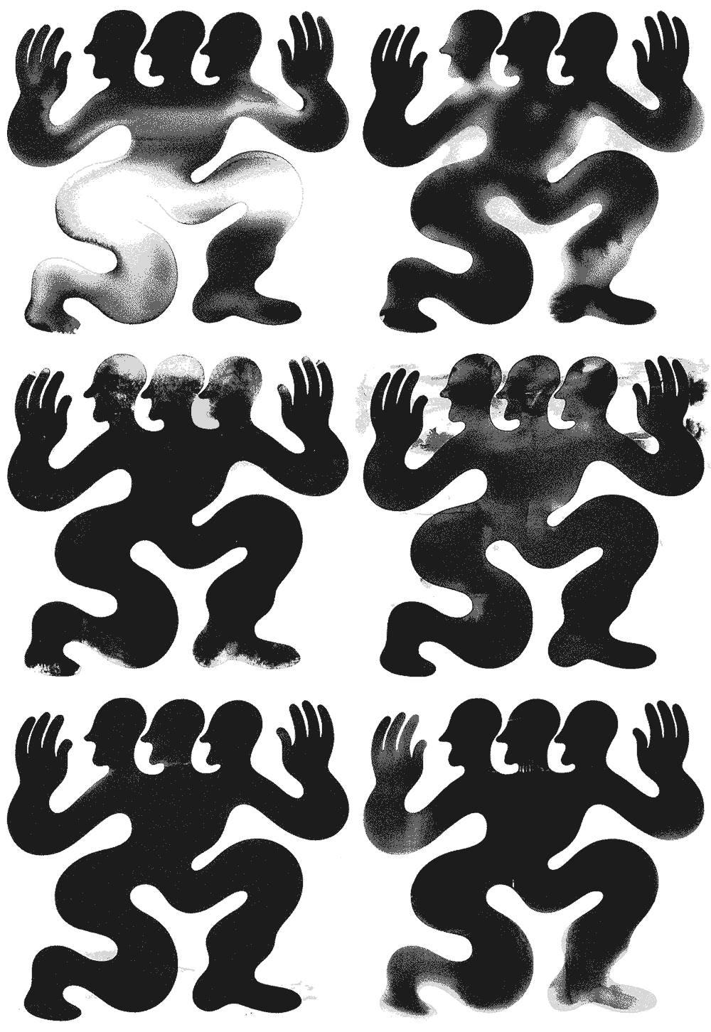
Putting a pencil in the hands of her inner child, she developed a playground of colourful 3D characters. Experimenting with textures, lighting and materials, the skilled animator produced a series of spirited characters, complete with individual traits and temperament, for the award-winning type publisher.
Kilotype’s brief allowed Aleks to follow her artistic instincts – to the letter. Playing to her strengths, she produced a striking showcase of shapes that tests the limits of the imagination.
Aleksandra Bokova
“The magic came from bringing all those colourful shapes to life, and treating each letter as if it had its own personality. I wanted the letters and toys to feel like characters in this playful little universe, each adding to the sense of wonder. “
French bulldogs, and vinyasana's. Rew brings an elevated calm to Fintech company Koto's brand.
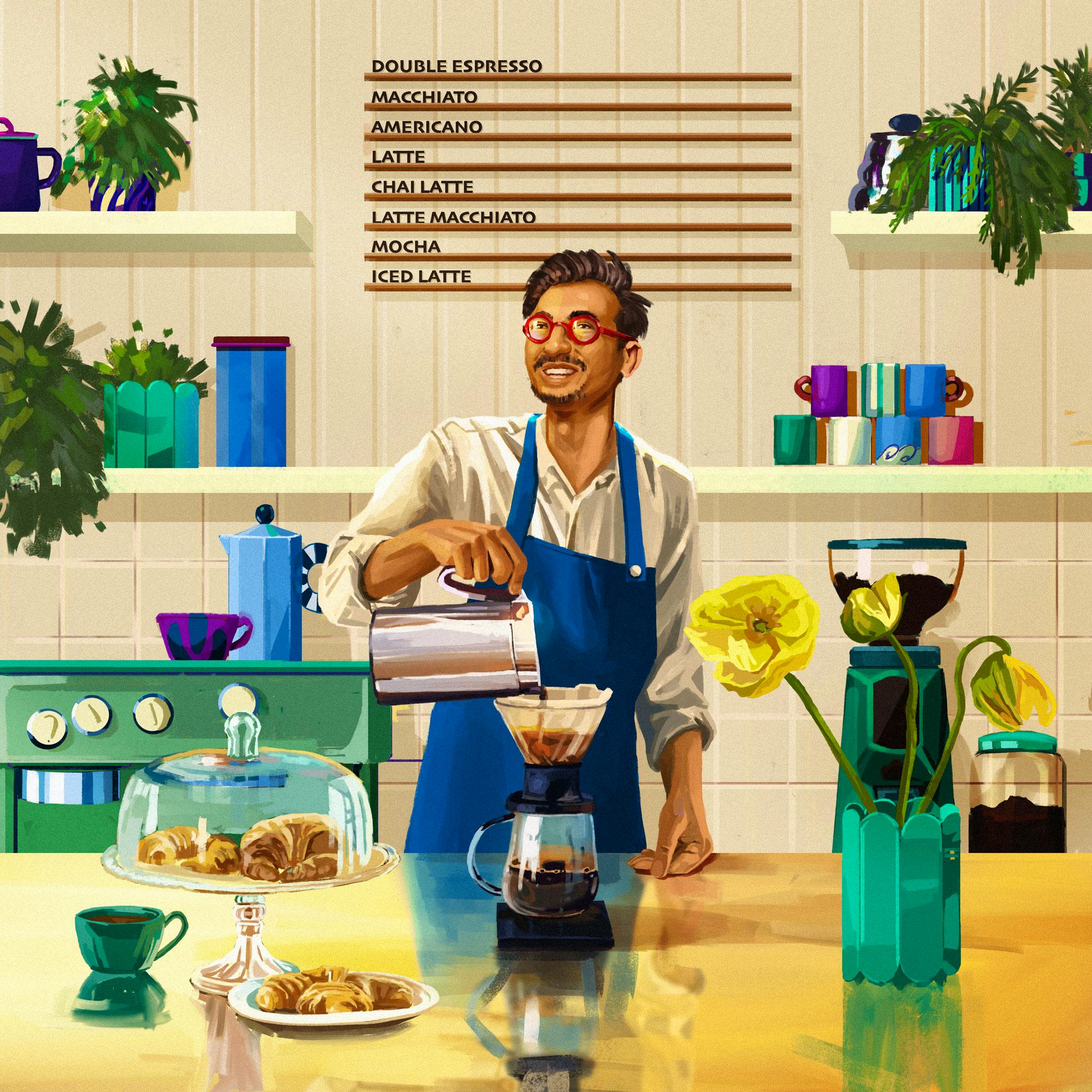
Most fintech visuals consist of technical illustrations or abstract iconography. It’s why Canadian fintech company KOHO’s latest art direction in choosing Rew is so refreshing. The platform’s imagery being brought to life in vivid shades, sunset vistas and sunbathing French bulldogs. Giving Rew creative freedom to develop real-world characters in work and at rest – free rein to push its art direction beyond the typical confines.
The platform’s imagery being brought to life in vivid shades, sunset vistas and sunbathing French bulldogs. Giving Rew creative freedom to develop real-world characters in work and at rest – free rein to push its art direction beyond the typical confines.
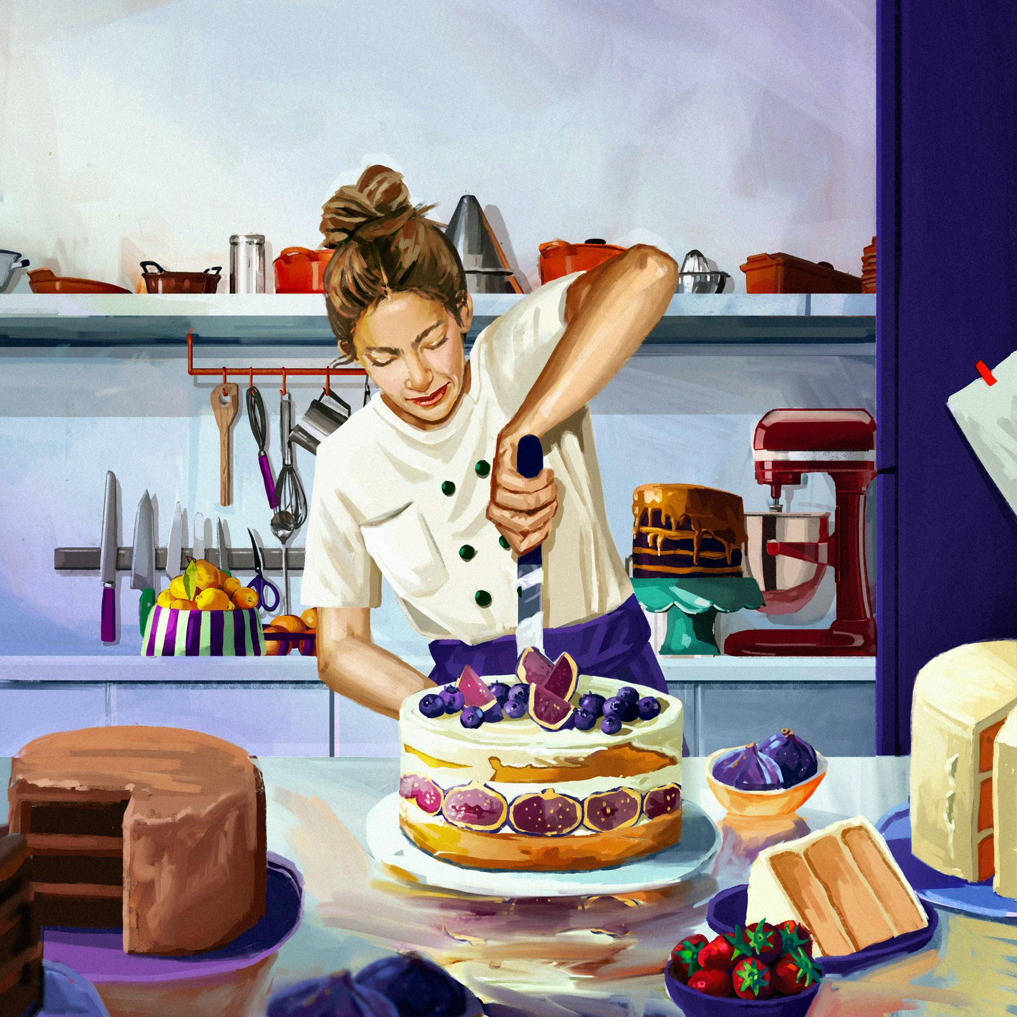
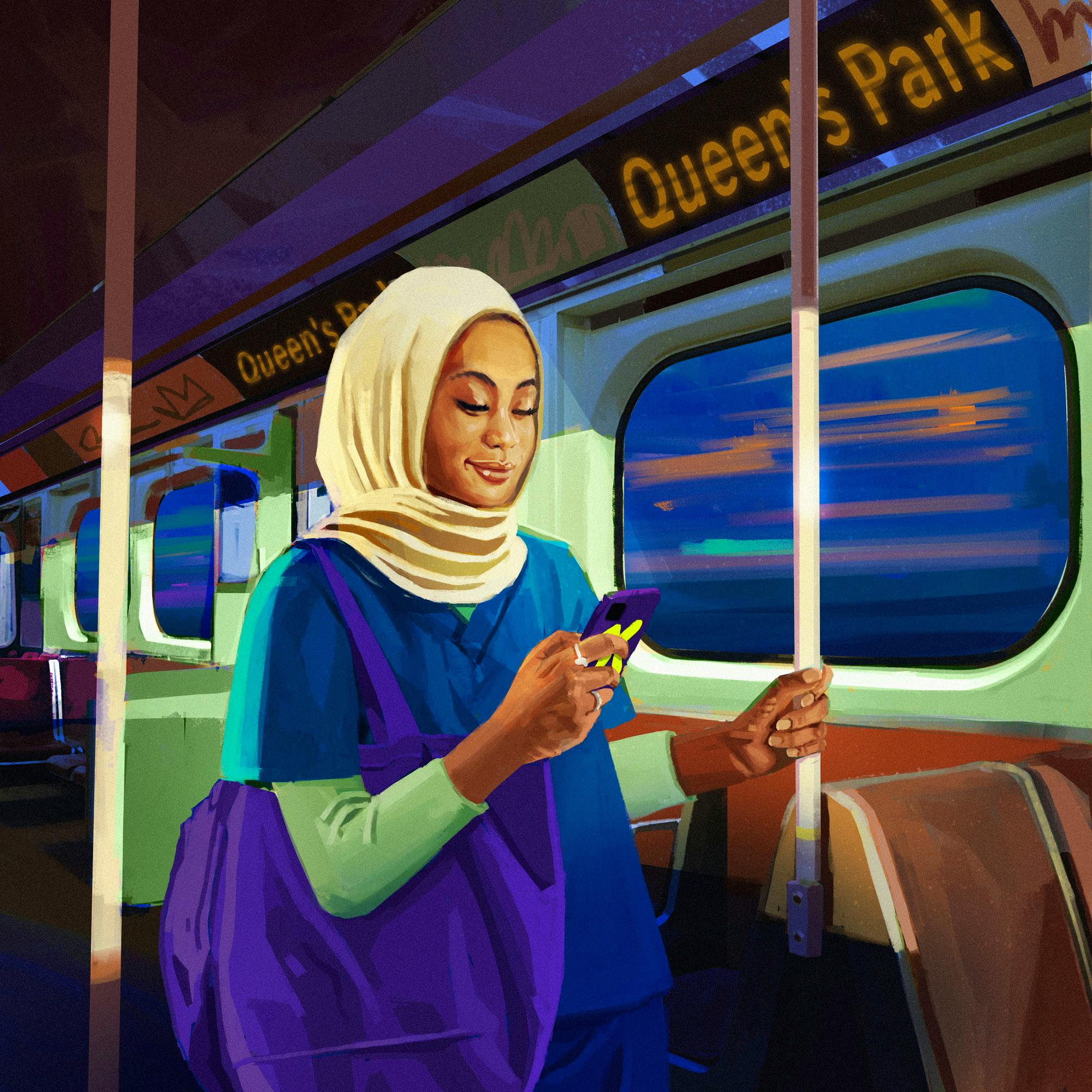
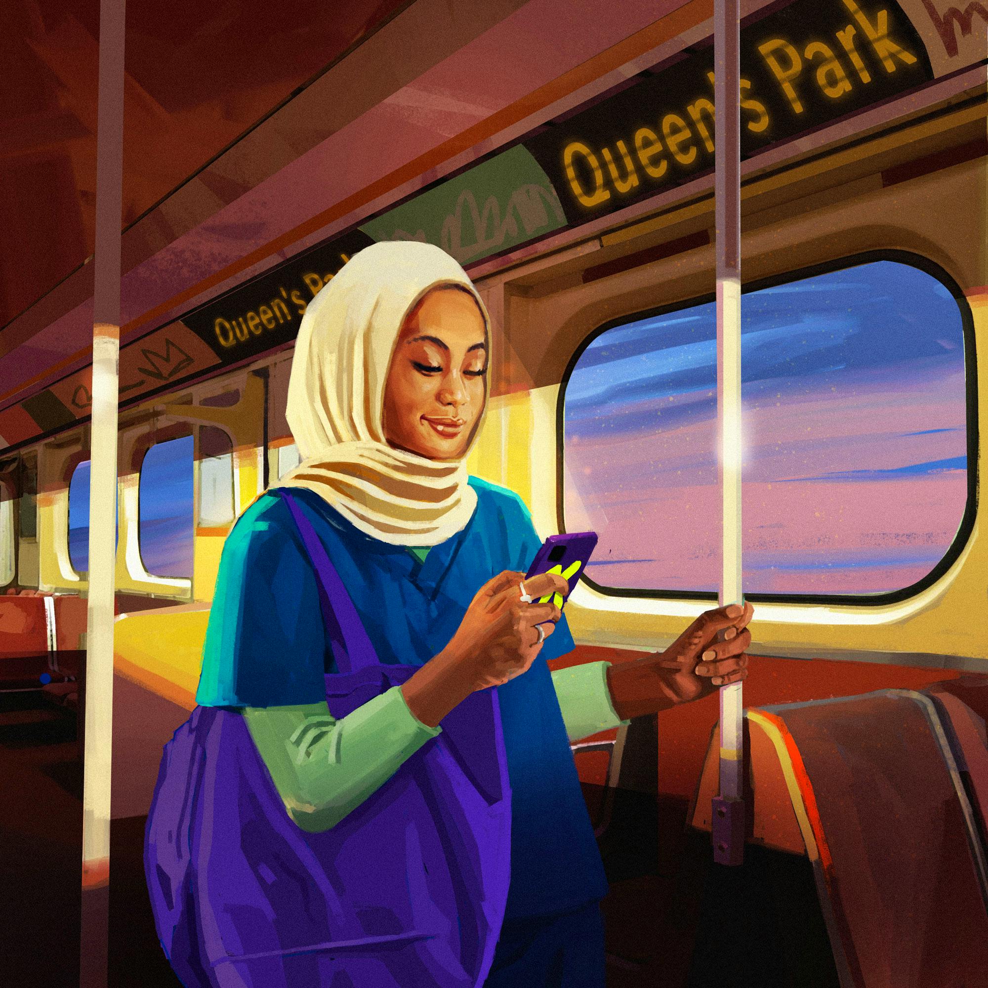
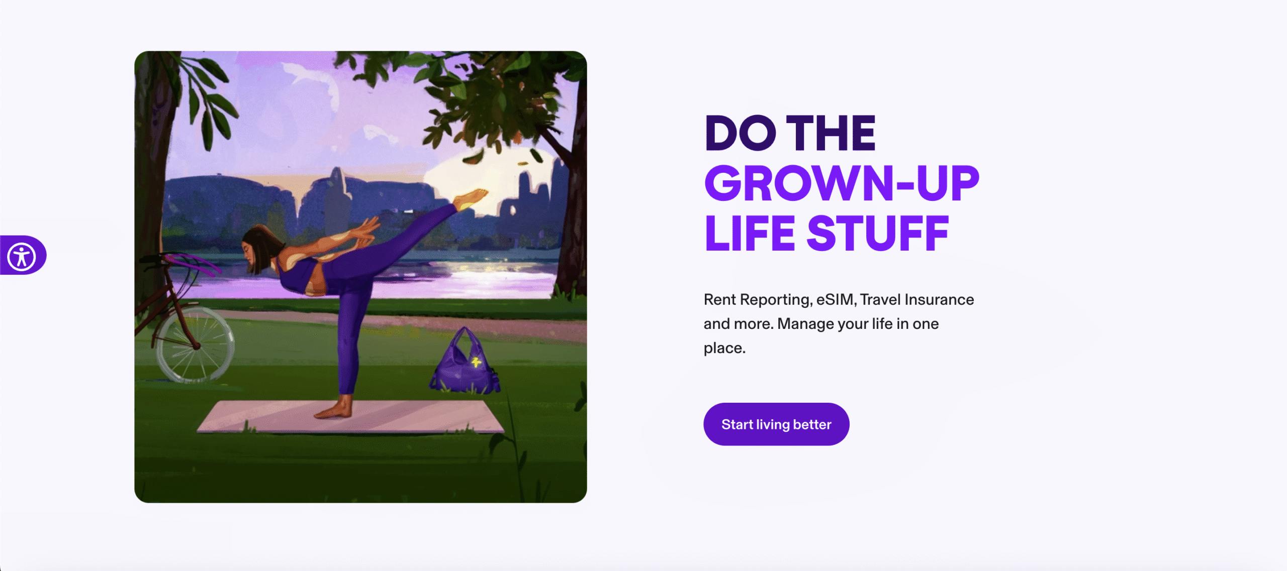
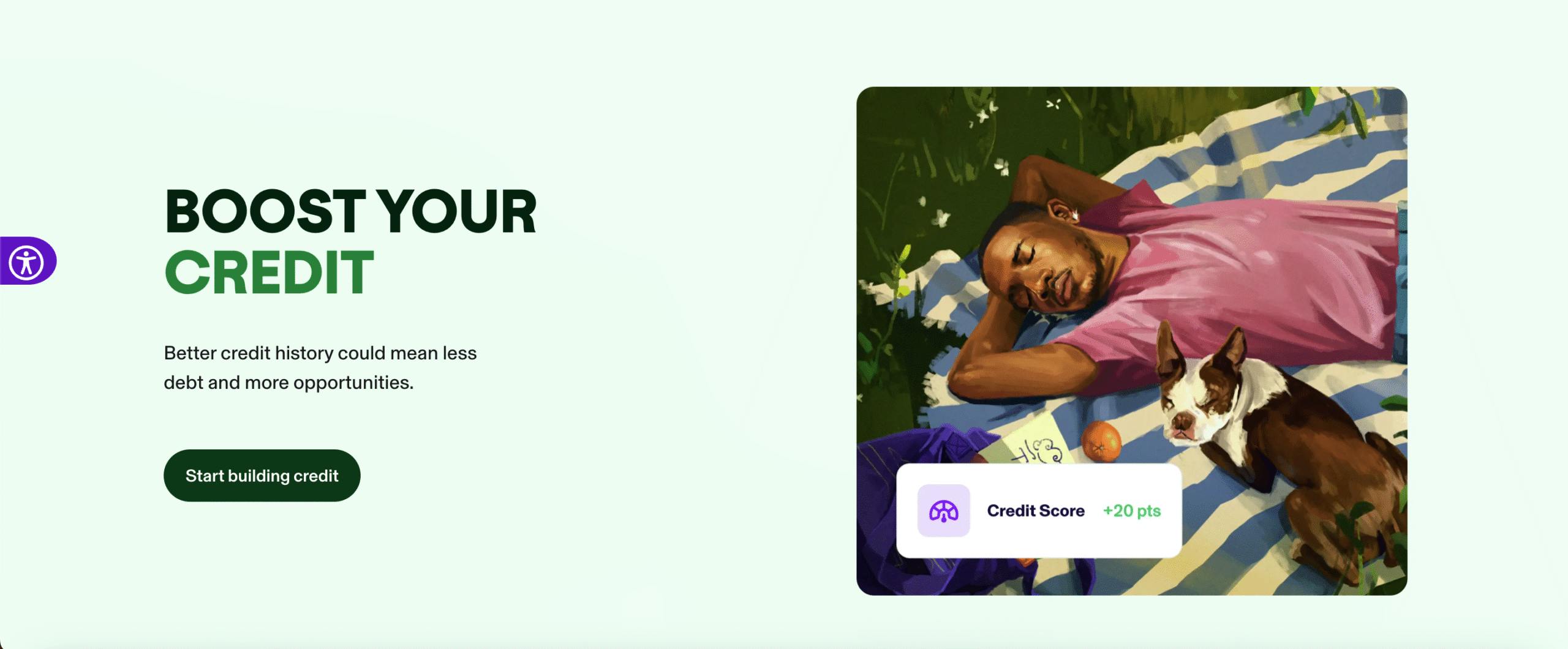
The exciting part is the range of characters that make sense in the KOHO world – from a guy relaxing in the park with his beloved pooch, the series also included a barista, a nurse, a chef and an animated gif of a yogi perfecting her pose in the dwindling sunlight.
The exciting part is the range of characters that make sense in the KOHO world – from a guy relaxing in the park with his beloved pooch, the series also included a barista, a nurse, a chef and an animated gif of a yogi perfecting her pose in the dwindling sunlight.
Rew
"Trying to keep a colour palette through different times of the day, and changing the light was new for me"
A feast for the eyes
Fashion giant Breuninger's annual Fashion x Food event in Stuttgart needed a visual language to link couture and cuisine. Known for reimagining worlds with bold colour palettes and mastery of pastel, TDF’s Josephine Rai was the perfect ingredient.
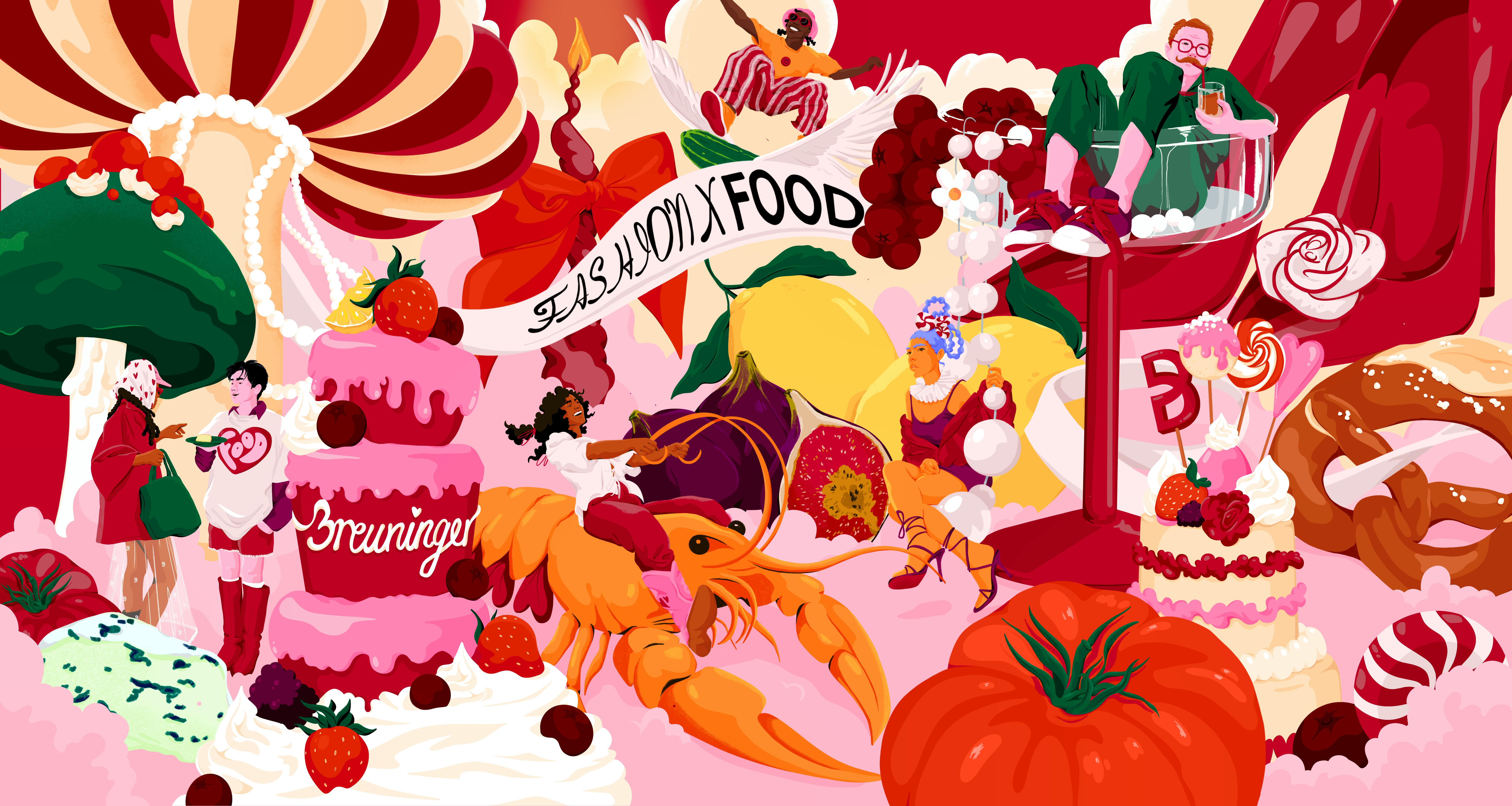
Using the concept “Taste the Flair,” and taking cues from Alice in Wonderland, Josephine conjured up a surreal world of elaborate cakes, cascading pearls, and wine glasses so large you could swim in them. Our favourite? The woman riding a life-sized lobster in bright pink cowboy boots.
Mixing Breuninger's signature red with her distinctive colour palette, Josephine’s artwork was the perfect backdrop for an evening of live cooking, with a lineup of Michelin-starred TV chefs.
You could say – she ate.
Josephine Rais
“For me, fashion and food go really well together. Personally, I love to go out for dinner and I love to dress up for that special occasion”.
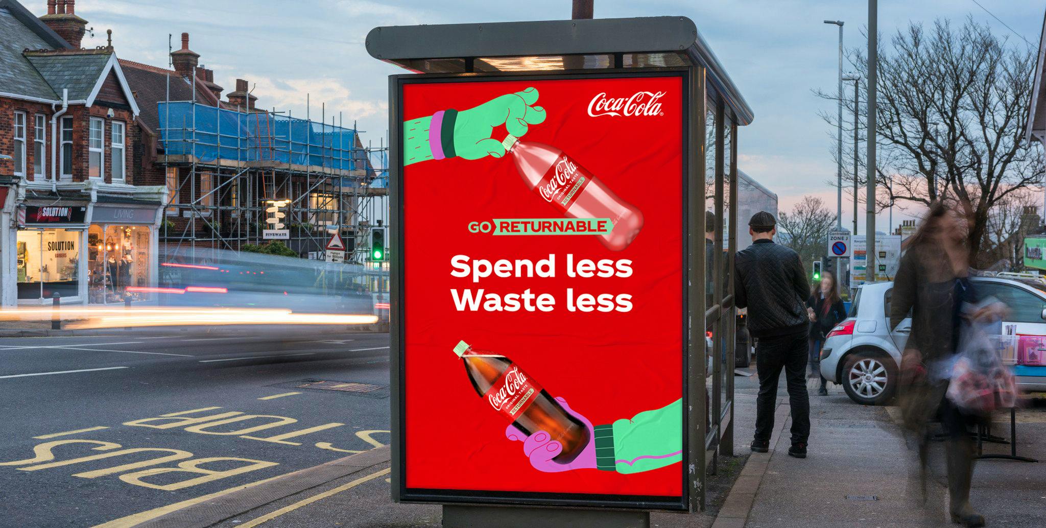
Juan Molinet adds retro fizz to Coca-Cola’s eco campaign
Blending bold colours, playful shapes, and 90s flair, Juan brings his signature pop to the latest phase of Coke Reborn—celebrating a greener future with a nostalgic twist.
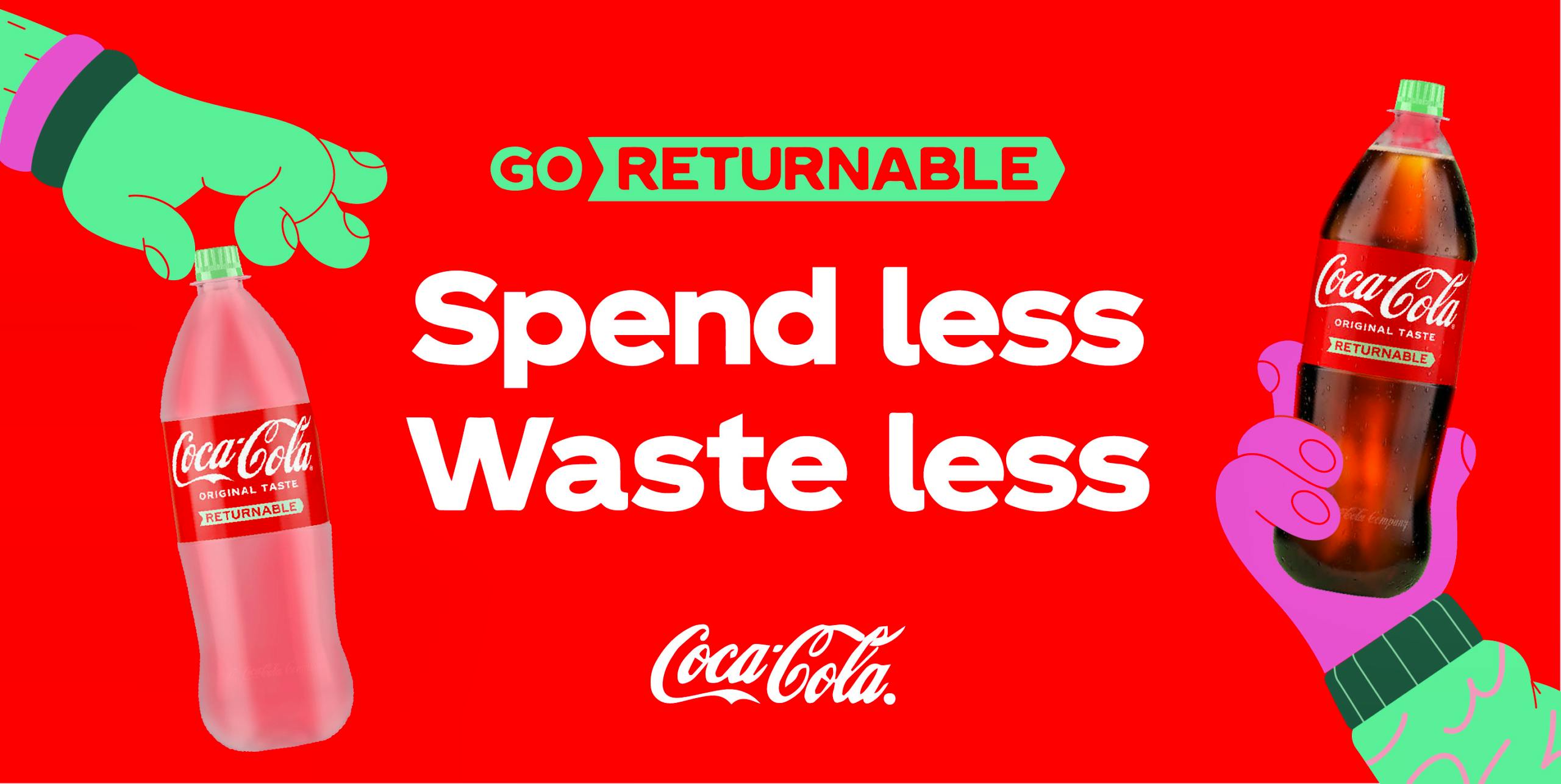
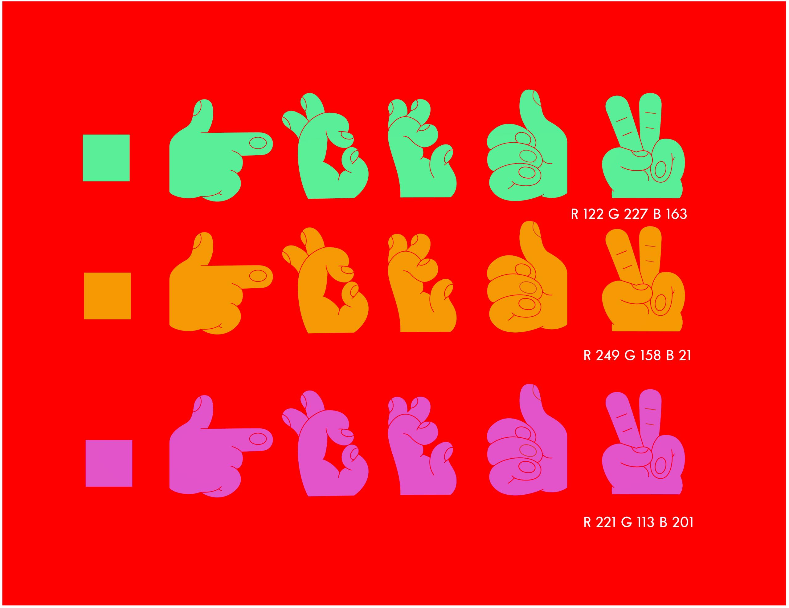
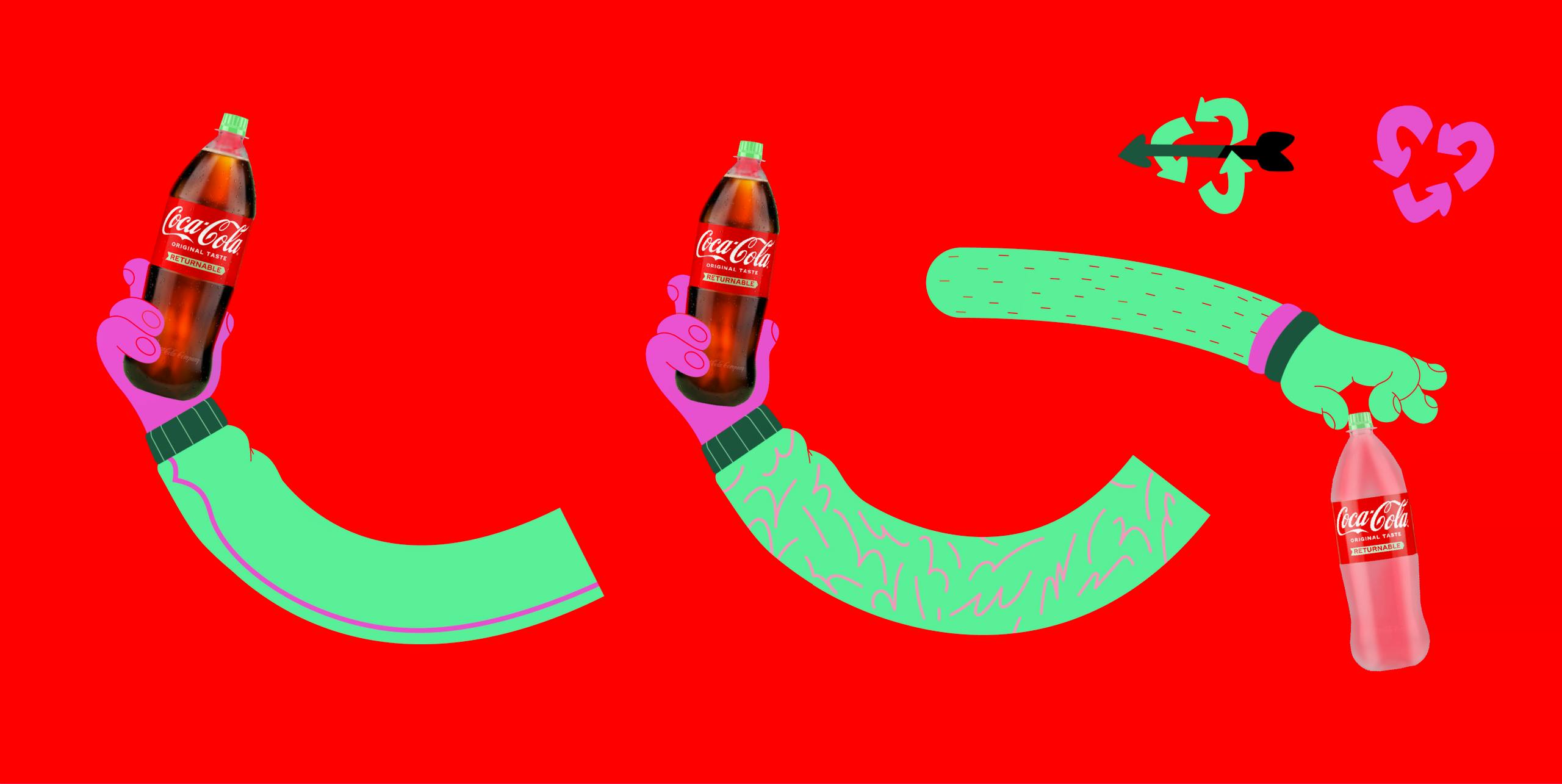
For the latest phase of Coke Reborn, its campaign promoting a greener world, Coca-Cola wanted a style that truly pops. Heavily inspired by the branding of his youth, Juan Molinet is known for putting an old-school spin on present-day packaging – and Coca-Cola wanted in.
Blending his trademark aesthetic with the brand’s global identity, Juan’s creative was an effervescent take on the company’s eco-friendly values
Juan Molinet
“I leaned into what I love – bold colours, playful shapes, and a lot of movement and energy in the compositions.”
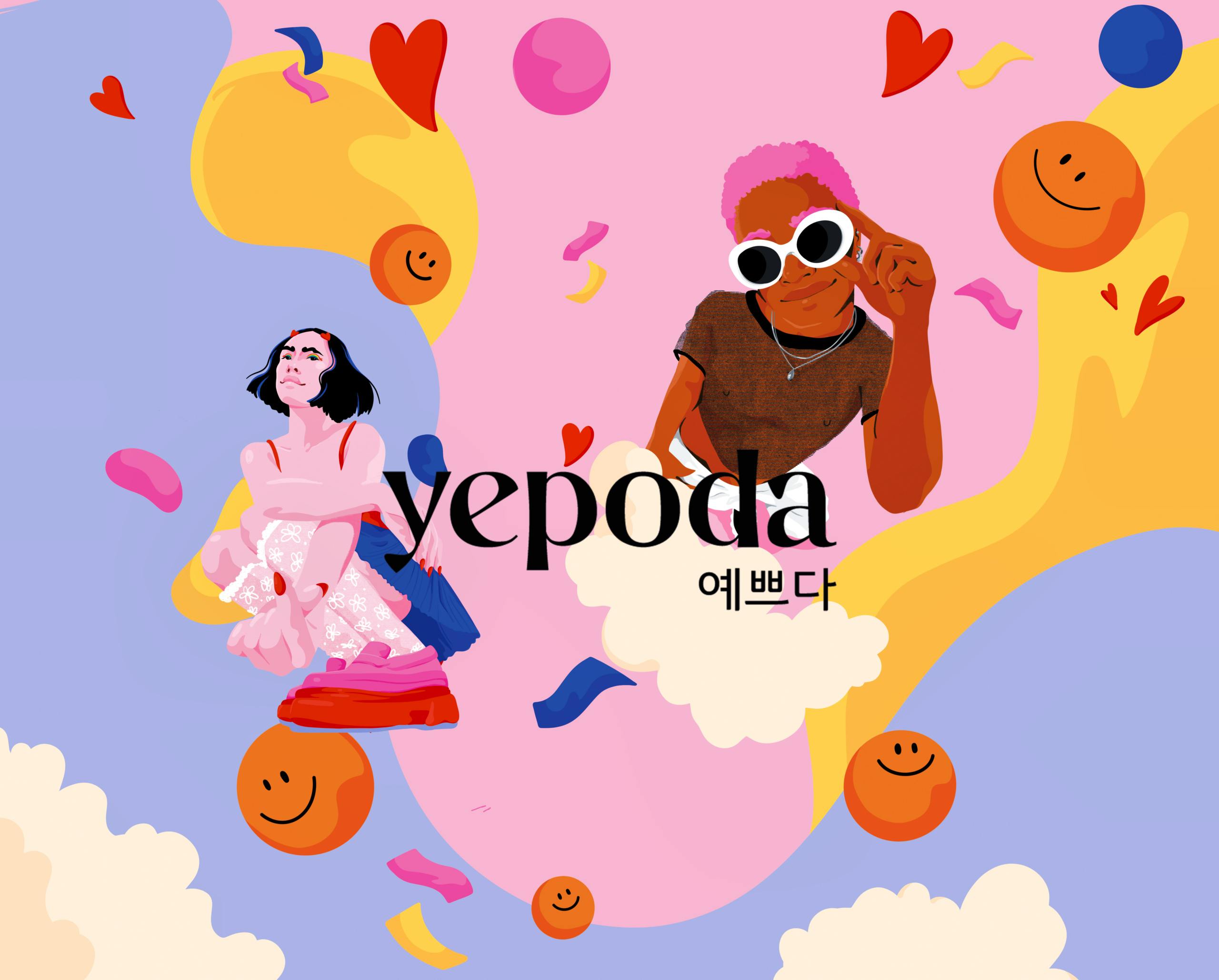
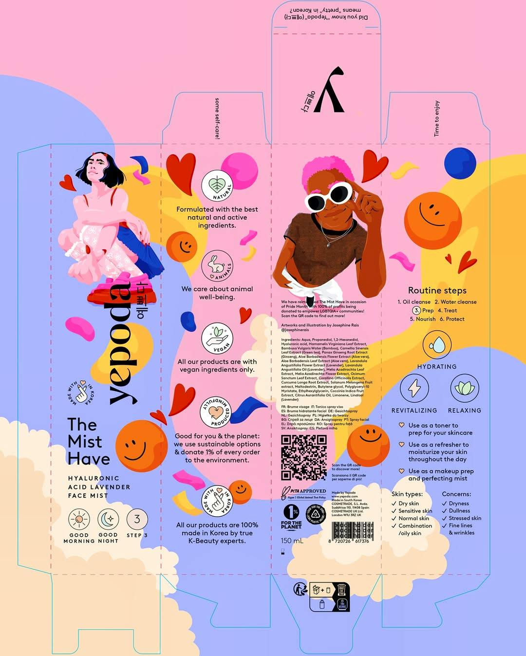
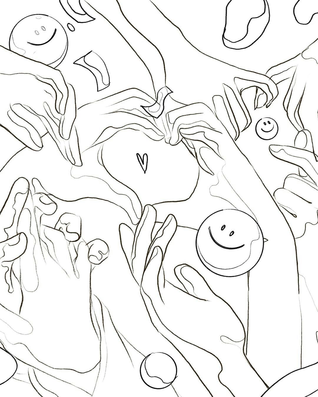
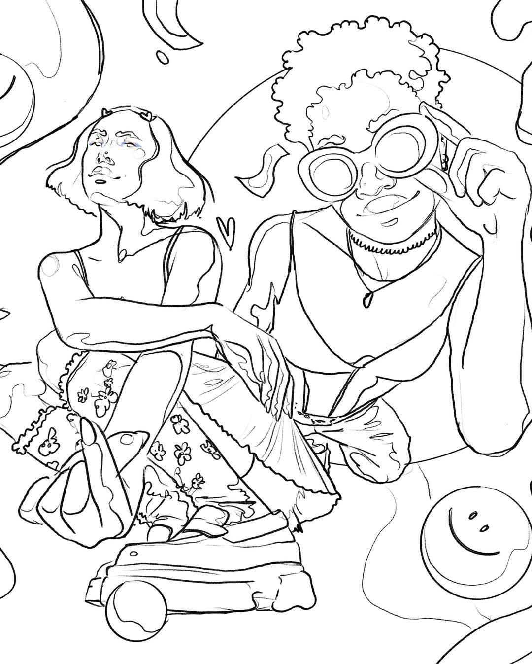
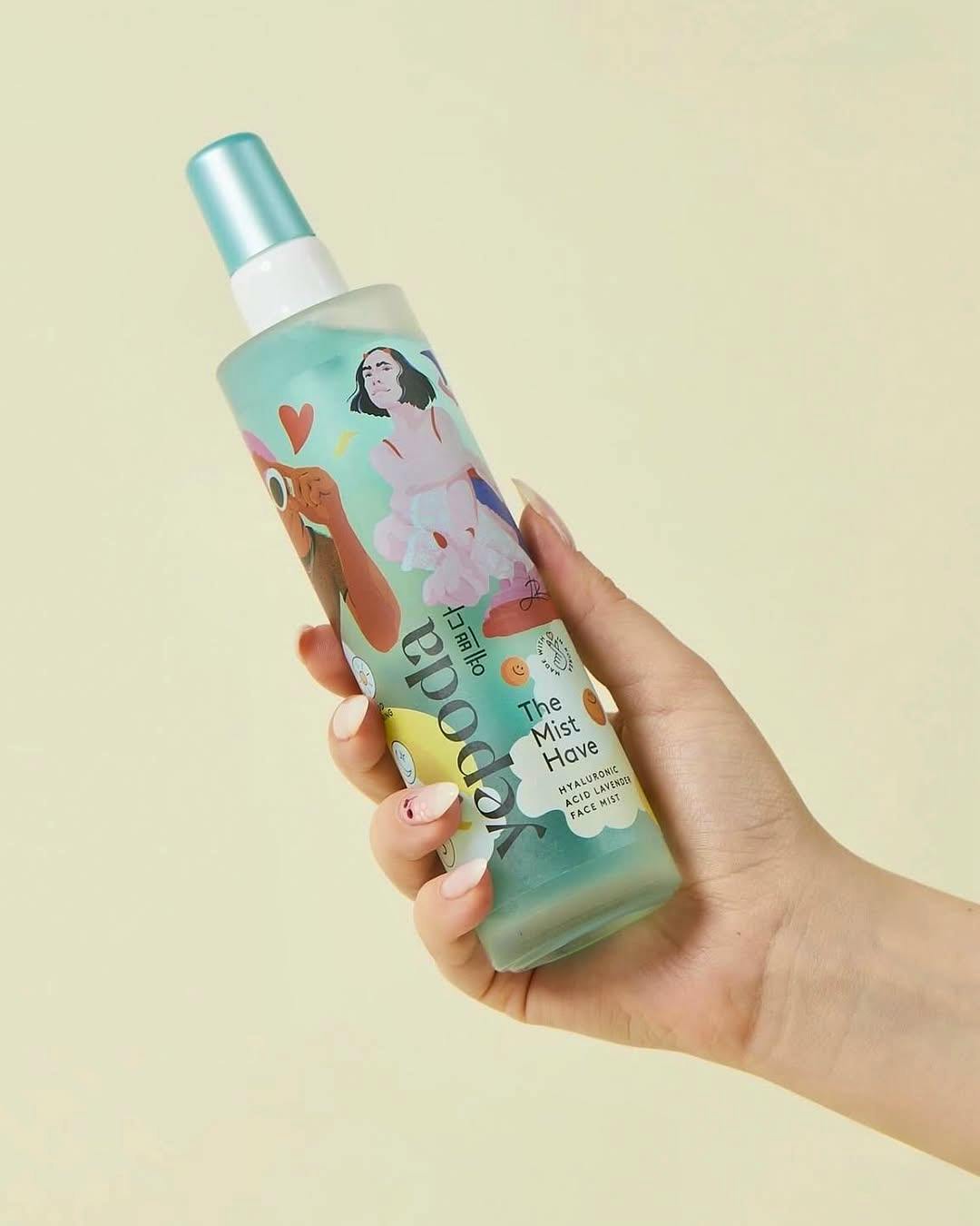
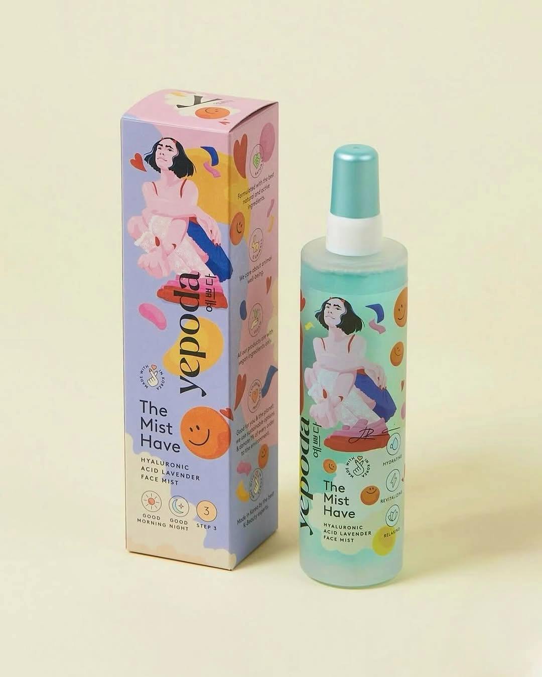
When Korean skincare brand Yepoda set out to create their Pride Edition of their cult-favorite toner mist, they knew it had to be more than just skincare.
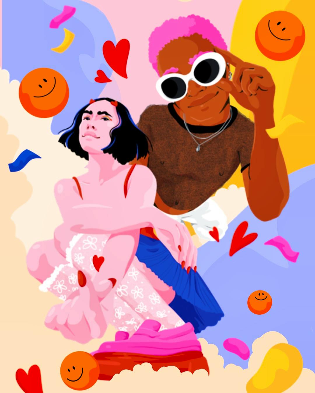
Josephine Rais, whose work bursts with bold colors, playful energy, and unapologetic joy was the instant choice.
For this limited edition, 100% of the profits go directly to LGBTQIA+ causes - meaning every spritz supports a community that Yepoda proudly stands behind. Josephine’s packaging design turns the mist bottle into a mini canvas: vibrant, expressive, and impossible to ignore.
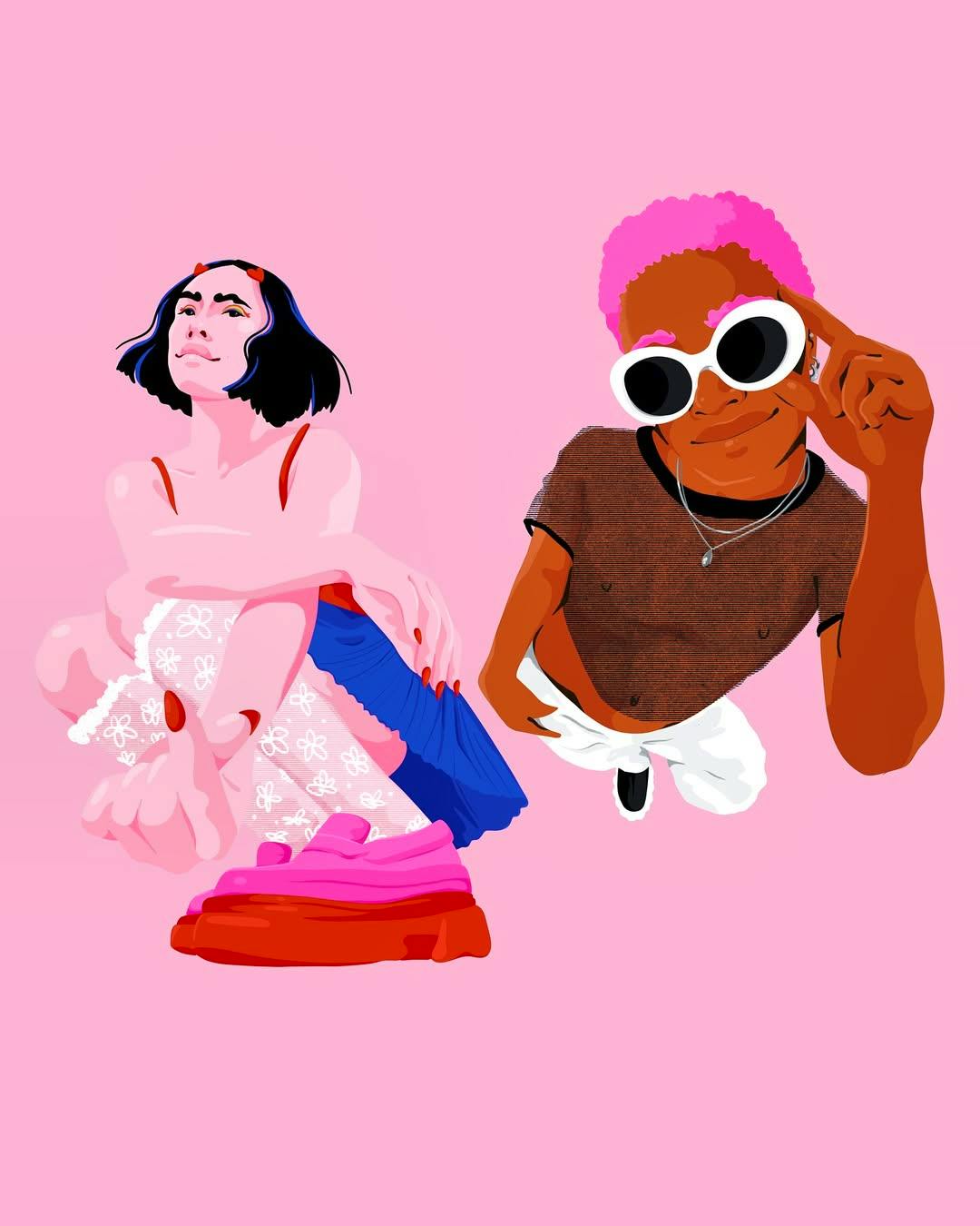
Symbolism drawn into every detail: flags woven into clothing & makeup, hearts as a symbol of love & figures blending across the gender spectrum. “Beauty is subjective - my goal was inclusivity. A wide range of people, all seeing their own version of beauty" Josephine adds. The impact - a sold out collections and €40,000 raised for LGBTQ+ organisations.
Josephine Rais
I wanted to make love visible — celebrating joy, queerness and self-care that reflects how Gen Z experiences and expresses themselves.
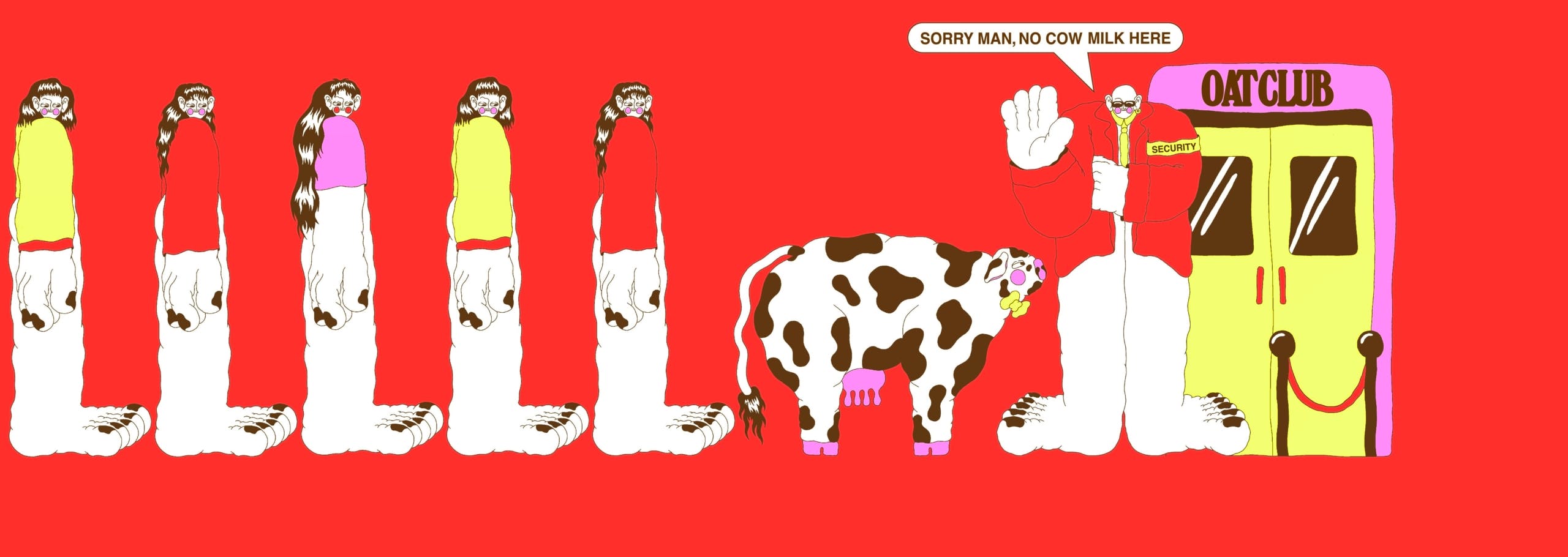
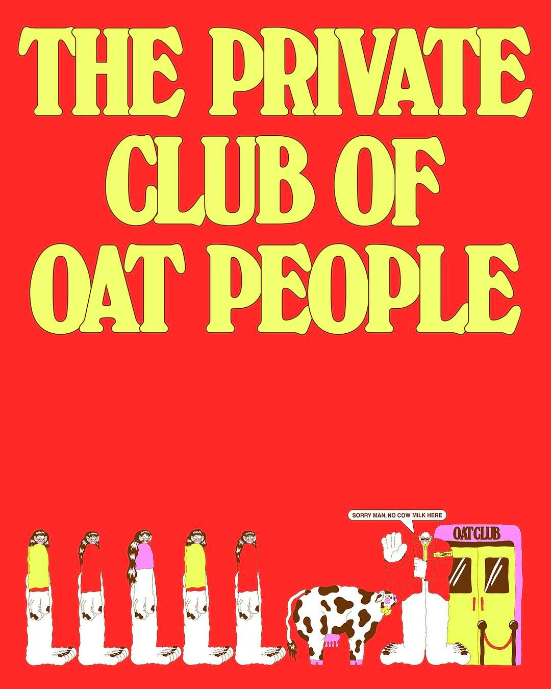
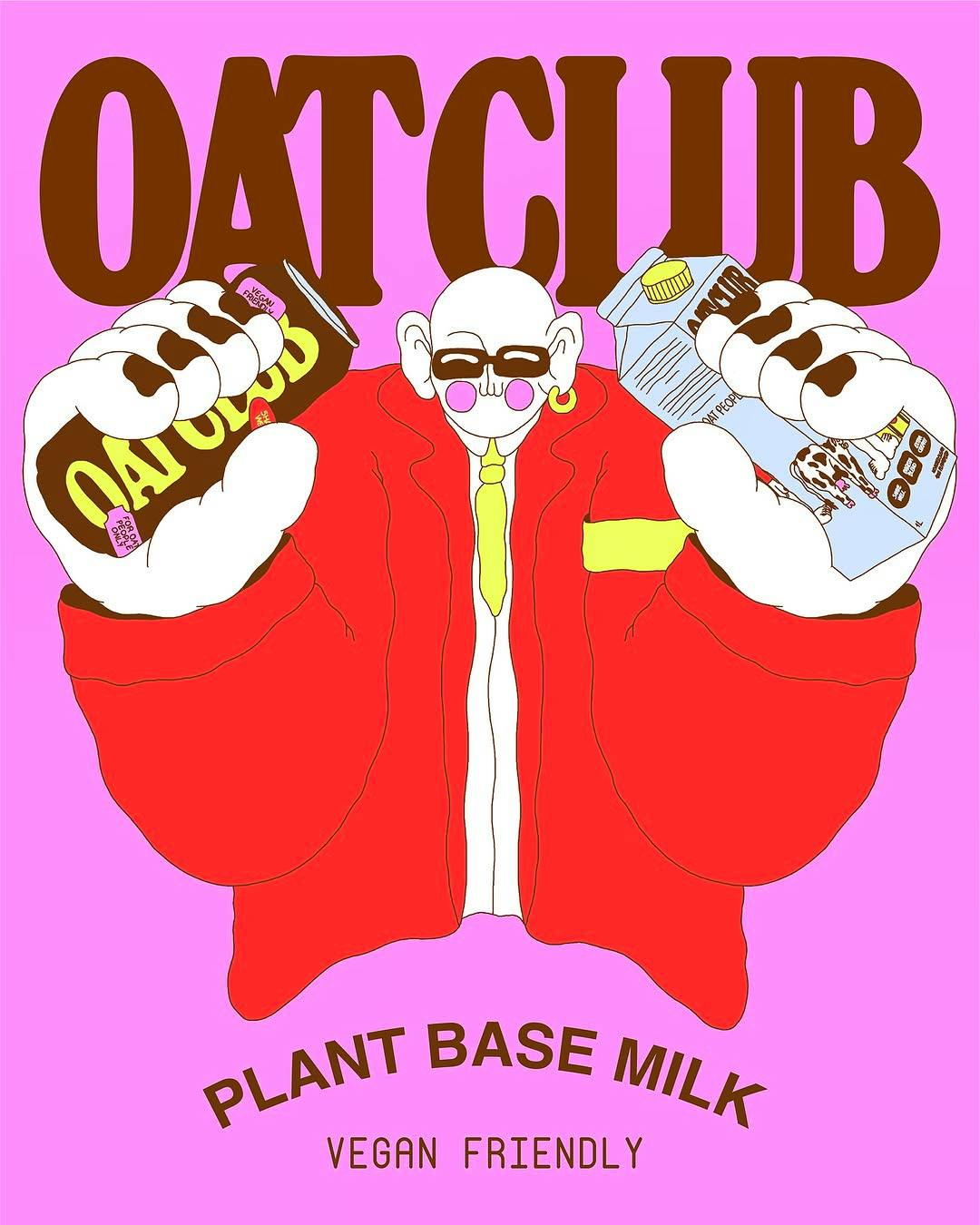
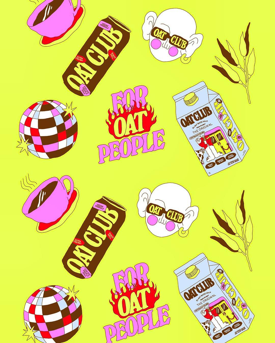
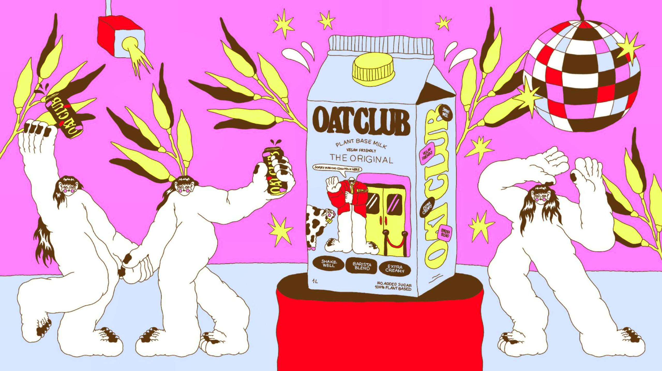
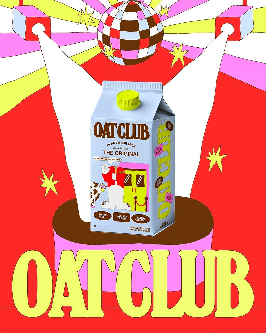
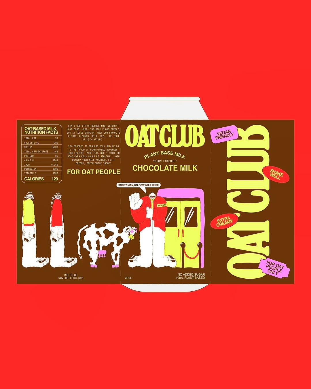
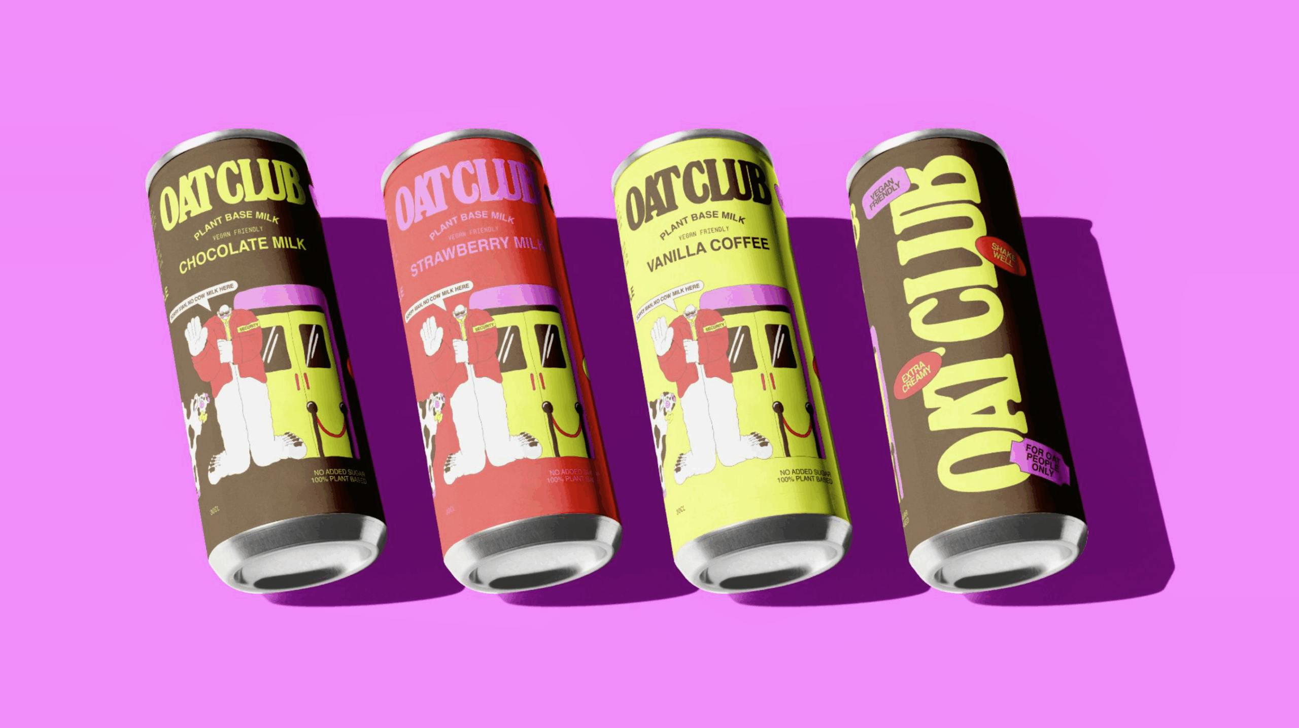
Justine reimagines an oat milk brand that breaks free from the sea of sameness
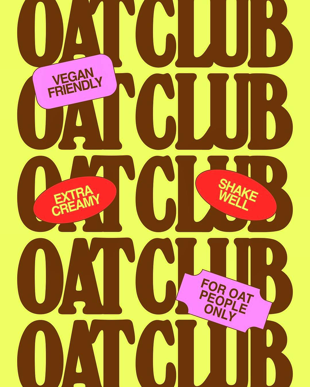
When we asked Justine to reimagine one of her everyday favorite products, she went all in – designing a whole campaign devoted to Oat Club: an imagined oat milk brand, “designed exclusively for oat people,” she explains. Infused with her signature style, from vibrant packaging illustrations to a playful cast of characters, every detail was designed to stand out on both shelves and on-screen.
Justine Jossart
"Little details are everything in surprising the viewer"
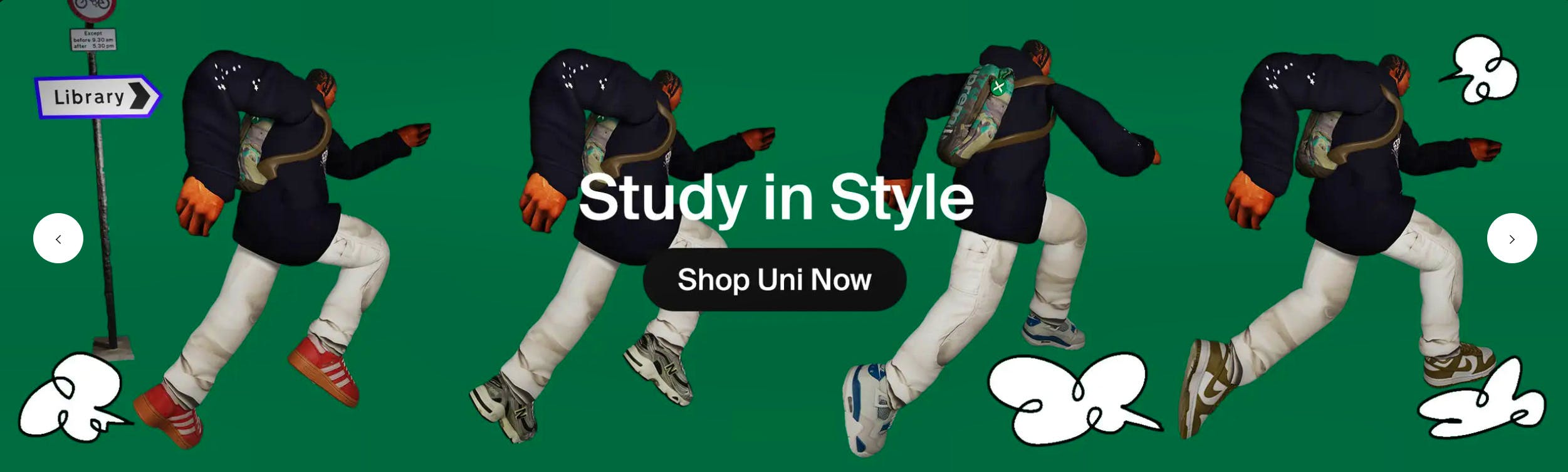
Troy Browne gives Stock X’s UK debut some serious sole
For the sneaker giant’s first UK campaign, Troy’s collage-inspired CGI animation takes us on a wild ride through iconic kicks—from adidas to Dunks.
In the talented hands of mixed media artist Troy Browne, even the freshest sneakers have an extra kick to them. US-based online sneaker marketplace Stock X wanted a killer first UK campaign, so its creative agency Otherway reached out to us.
And we provided the production. Troy delivered a ‘back to school’ CGI animation. A new approach, in his inimitable proportion-playing collage style. Beginning with unboxing orange Adidas Spezials; vaulting into Nike Airs, New Balance and On sneakers; ending with – our pick – a pair of brown Dunks.
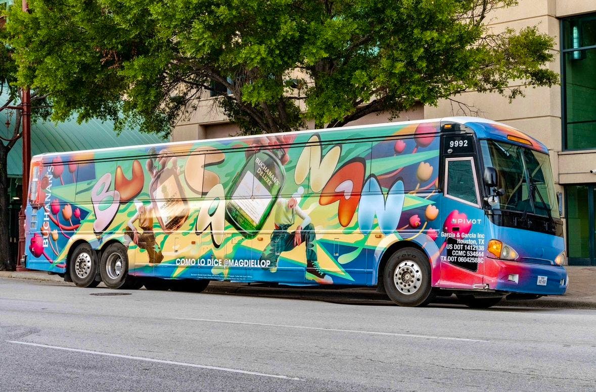
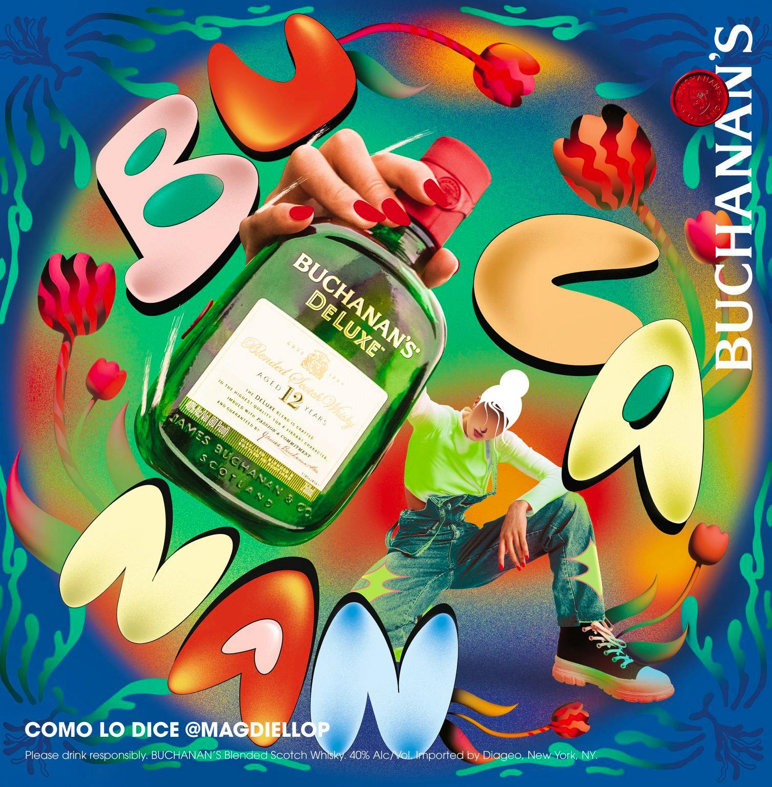
Magdiel Lopez hits the road with Buchanan’s and a bold take on identity
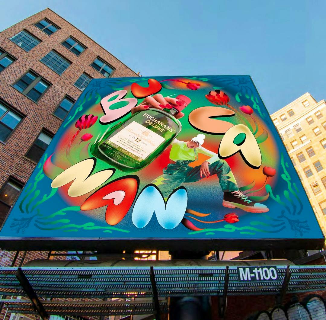
For the #ComoLoDigas campaign, Magdiel turned a Houston-bound bus into a rolling tribute to language, heritage and the many ways to say “Buchanan”.
As part of its #ComoLoDigas campaign, Buchanan’s Whisky wanted to celebrate the diversity of Hispanic American culture by honouring the multiple pronunciations that exist for ‘Buchanan’ within the same community. Alongside other local artists, Magdiel Lopez created a typographic treatment for the pronunciation which best reflected his community’s relationship with the brand.
And on a bus bound for Houston, that articulation came to life. A vibrant expression of his personal style and heritage, Magdiel reinforced the campaign’s concept by playing with perspectives to give onlookers pause for thought.
Body Shop, South African style
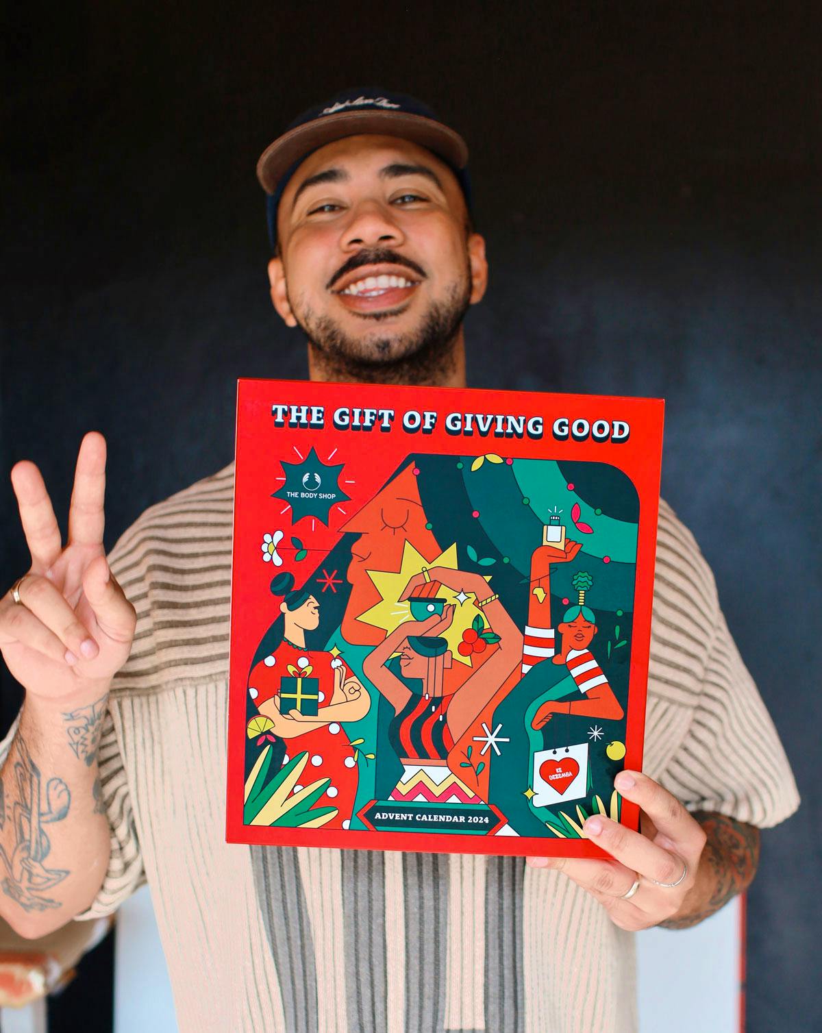
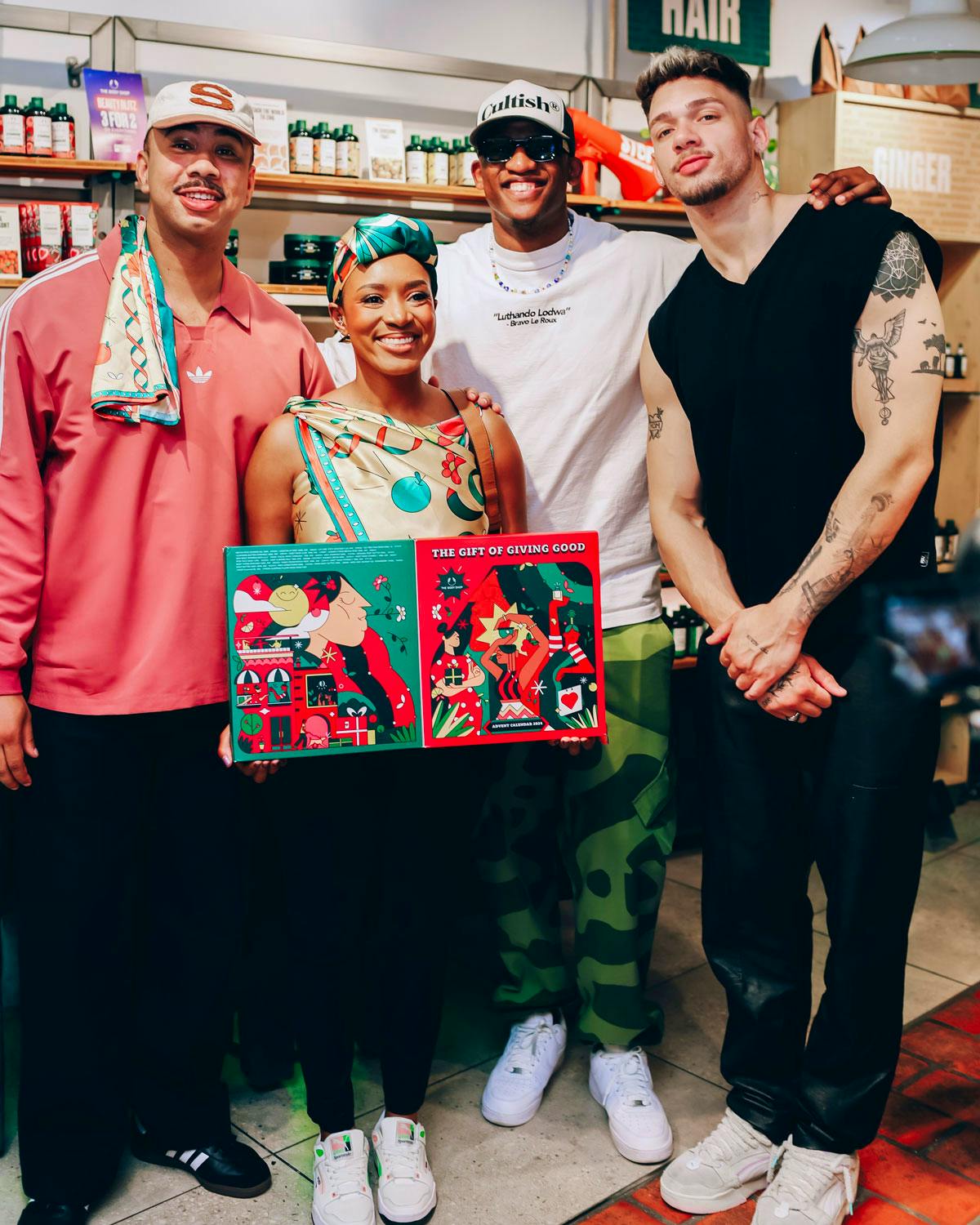
From its flagship stores to its festive celebrations, Yay Abe’s art is now a fundamental part of The Body Shop’s presence in South Africa.
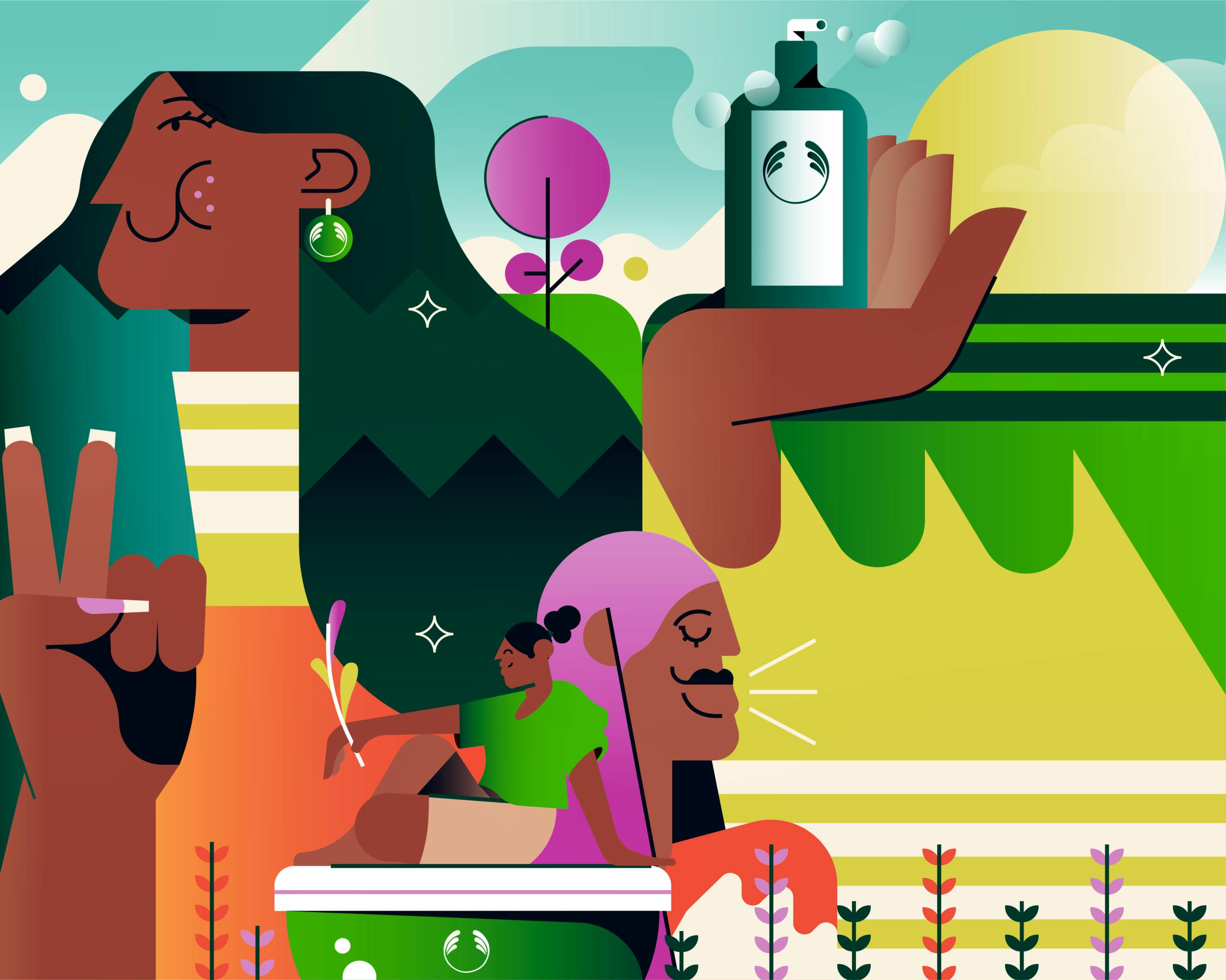
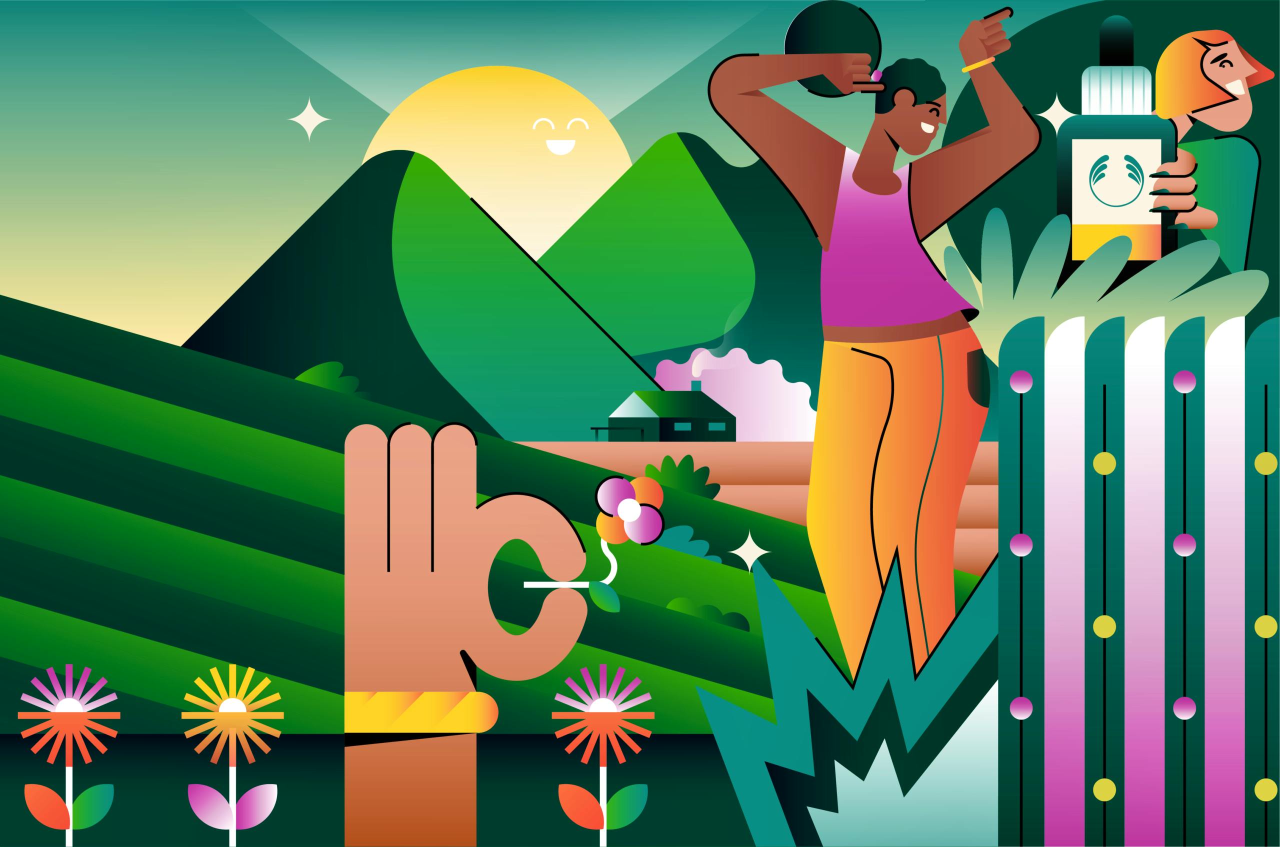
Commissioned by the retailer to create nine distinct murals for nine different branches, the TDF artist started with local landmarks – and added an Abe twist. By infusing each piece with distinct cultural relevance, he wanted to create something “instantly recognisable but still unique to the area it represented”.
The overarching concept, Yay says, was simple: “make it proudly South African”. Painting in front of a live audience at the launch of a store in Cape Town reinforced the collectivity running through his work. The murals’ impact led to the creation of an Advent calendar, a tangible expression of South African culture and a keepsake for the people who call it home. For Yay, “this one felt different”. We see why.
Yay Abe
“It’s about celebrating the Mzansi spirit. South Africa is so diverse and rich in culture, and that’s what we wanted to highlight”
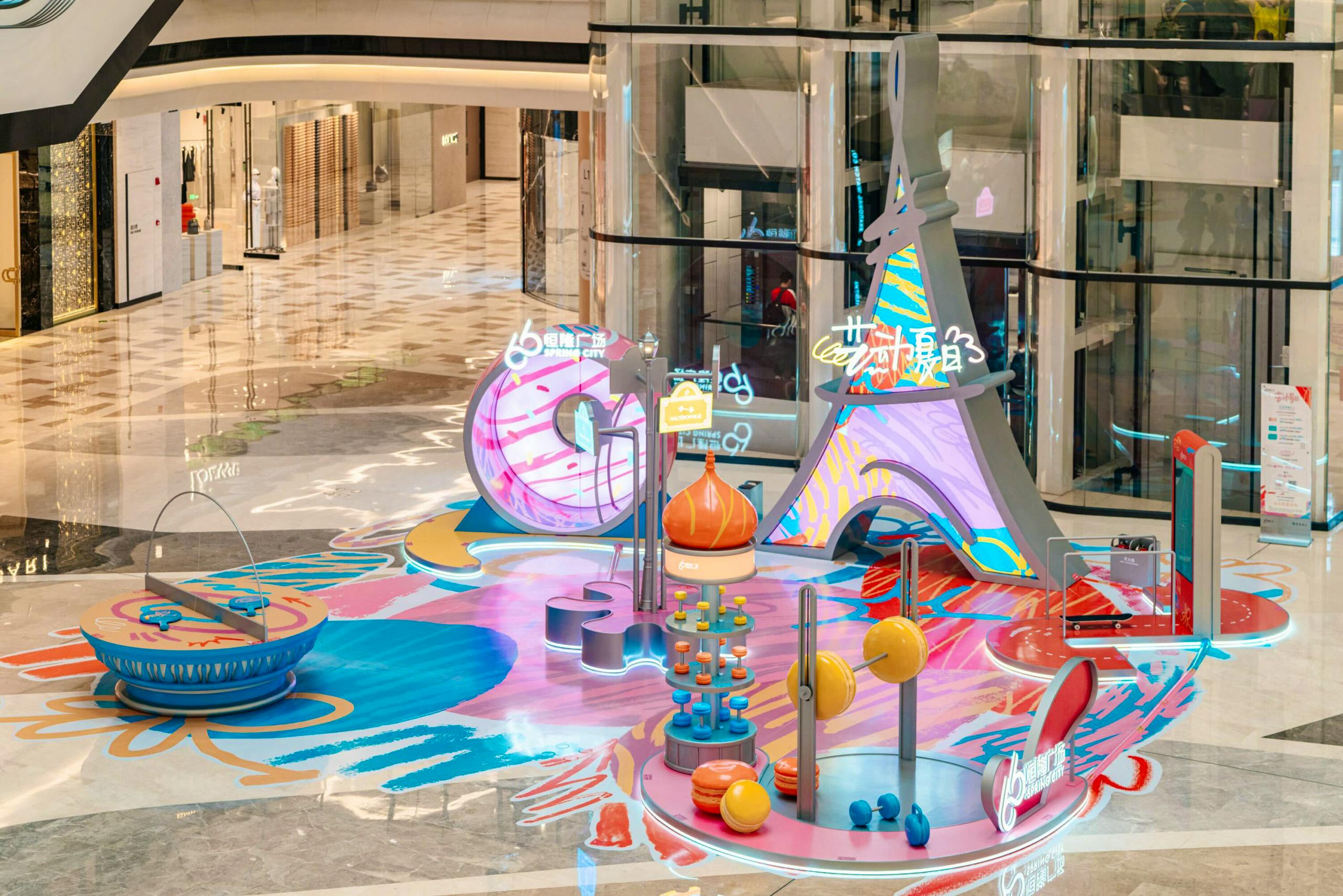
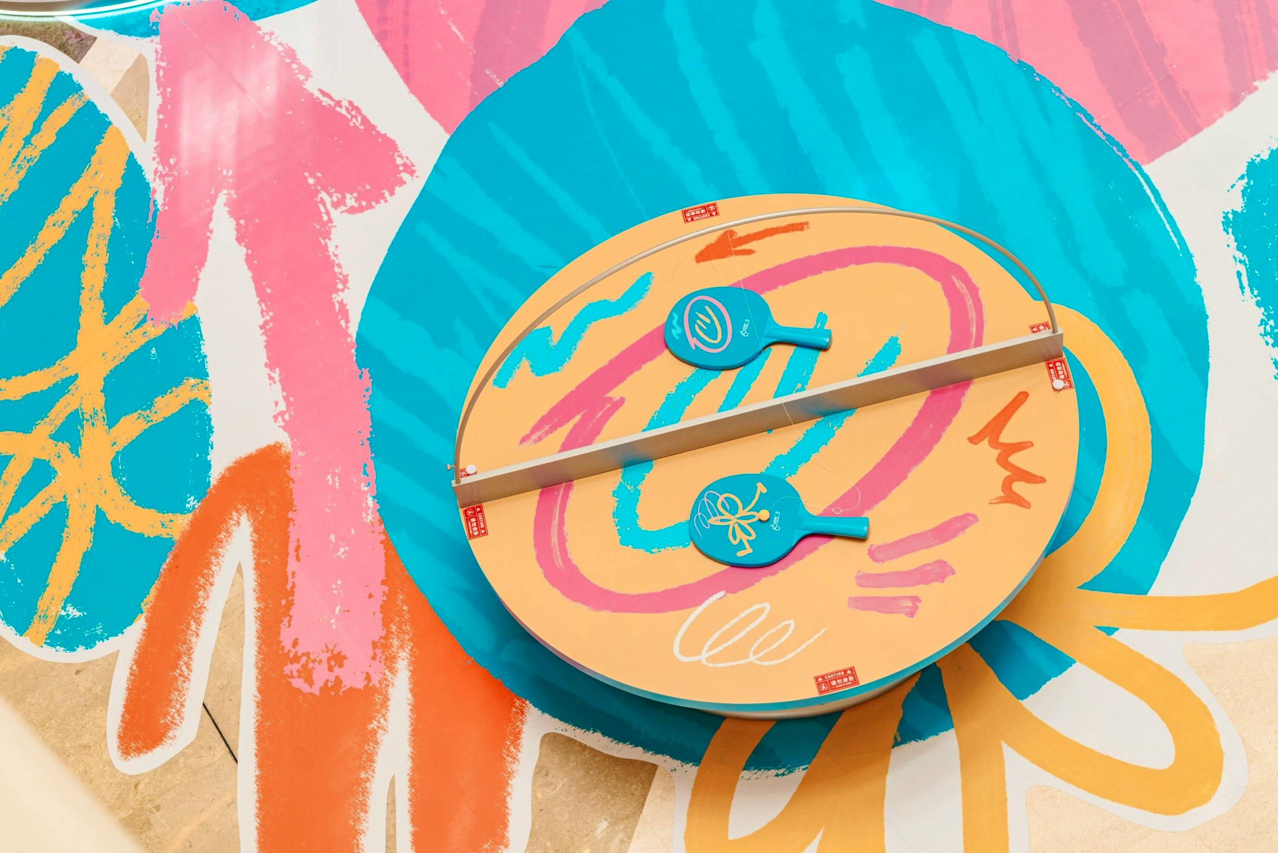
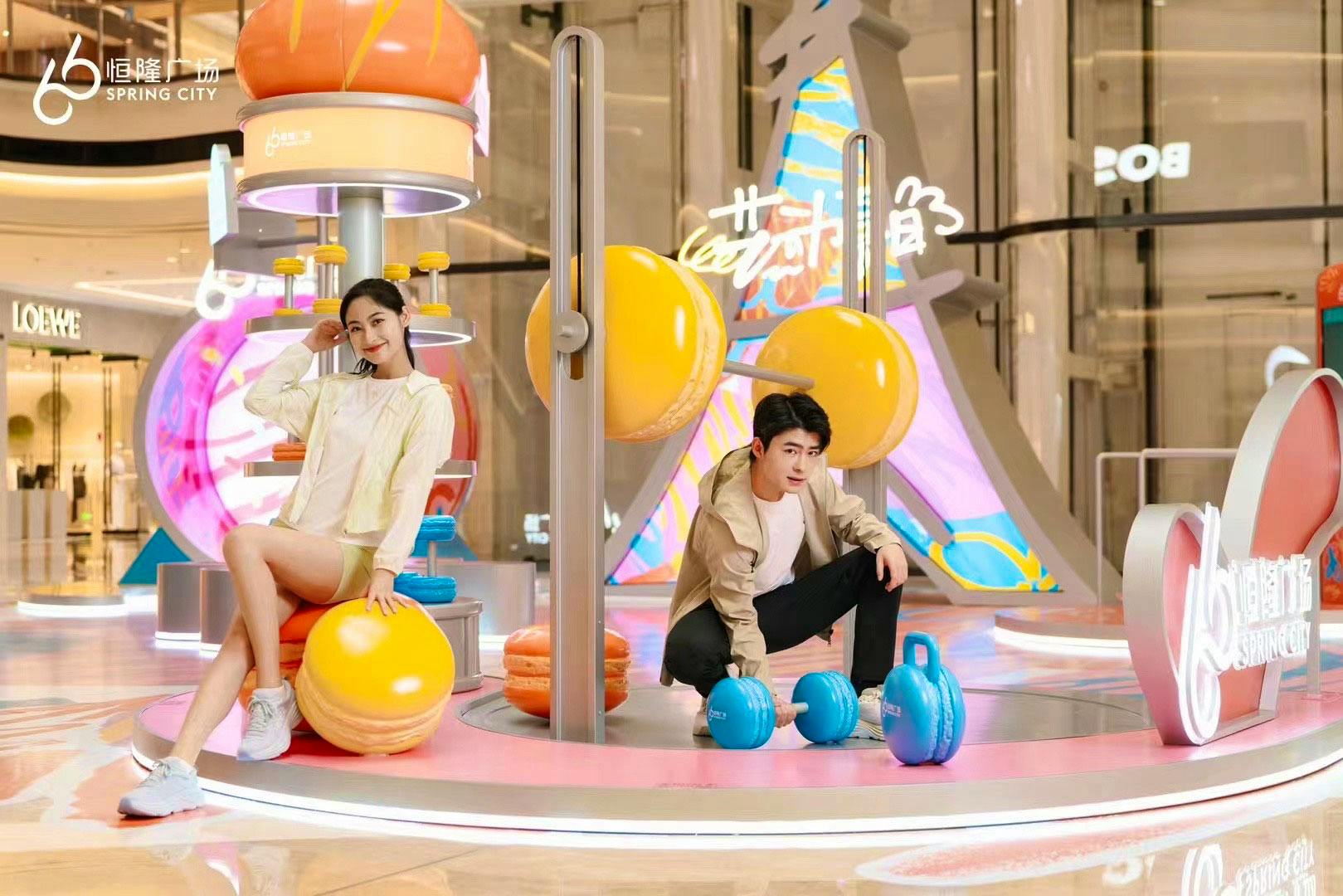
What screams ‘global sporting competition in France’ better than macaron-shaped dumbbells? oh and a baguette-shaped boxing bag.
Bernardo Henning put his stamp on an immersive installation to celebrate 2024’s Olympic hosts. Commissioned by V/Collective for Hang Lung Malls in China, Bernardo worked on his creation from afar which was a welcome challenge.
Having previously collaborated with Bernardo, V/Collective knew he’d make the perfect fit for such a playful (both visually and physically) project. “The advertising landscape in Asian countries like China and Japan is incredibly exciting,” says TDF’s Em. “We hope this momentum will lead to more installation projects here in the UK and across Europe.”
Bernardo Henning
“I’m always focused on digital work and an installation is a big step, but that's what I liked most about this project. It meant working on a new scale and thinking about how people would interact with it."