Roll out the red carpet…

Legendary British culture magazine i-D teamed up with eyewear titan Ray-Ban, asking their favourite artists to reimagine the colour red. The project also invites emerging artists to submit their own red artworks for a chance to feature in a digital zine. Safe to say, Maxime Manga’s burning-hot talent was top of their list.

What does red make you think of? Perhaps lipstick, stop signs, or roses. Perhaps King Crimson’s album Red, or Taylor Swift’s. Perhaps you think of risk. Did you know that boxers who wear red are more likely to win, and that poker players are more likely to bet when they have red chips?


For Maxime, this intensity is crucial. He describes red as the “gentle violence of humanity,” recalling the blood that runs through our veins, the rosy red that flushes our cheeks. ‘Gentle violence’ is also a lens through which to view Maxime’s art, which mixes aspects of life that are often juxtaposed: "Things that normally don’t go together, but when you see them, you realise they were meant to go together," he says. He calls this his ‘chaos’ – and it made him the perfect artist to channel a colour associated with extremes.

Maxime’s final work enshrines a portrait in flecks of red – from crimson to scarlet, ruby to oxblood – and feathers the figure’s shoulders with his signature mixture of soft brushstrokes and jagged, geometric textures. A pair of sunglasses, lifted up and resting on the forehead, allows for a direct gaze. This is red as fiery, urgent, and defiant.

The final piece enshrines a portrait in flecks red from crimson to scarlet, ruby and ox-blood, and feathers the figure’s shoulders with Maxime’s signature mixture of soft brushstrokes and jagged, geometric textures. A pair of sunglasses, lifted up and resting on the forehead, allow for a direct gaze – this is red as fiery, urgent and defiant.

This track got tropical.

Bernardo Henning works at full throttle – and it shows. With style equalling energy, Sol de Janeiro was sold.

Sol de Janeiro commissioned Bernardo to design its race car for GP Explorer, the annual automotive competition in France. Creating a custom Formula 4 design for a global brand? All in a day’s work for this Argentinian artist.

Partnering with Ex-Machina, Bernardo brought Brazilian beach vibes to the world of motorsport – and made it look easy. With tilted lines and tonal transitions, the bodywork was a perfect fusion of brand essence and event intensity.

Bernardo Henning

“The overall idea was to work with lines that reflect speed, but that also fit the car's shape in a natural and organic way.”

His first time designing a racing car, it was a thrilling change of gears for the artist. “I was really excited to expand my style into something I've never done before. My work reflects a lot of energy and speed, so this was a perfect blend for me.” With Bernardo in the driving seat, Sol de Janeiro brought true dynamism to the track.

Photography: Felix Afchain

It's getting witchy and weird.

Jess Bianchi is renowned for her ethereal, anime-inspired depictions of fantastical beings and women warriors. She was the obvious choice to give Summoner gaming studio's typically brutalist aesthetic a new direction.

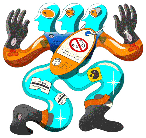
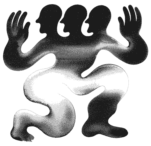
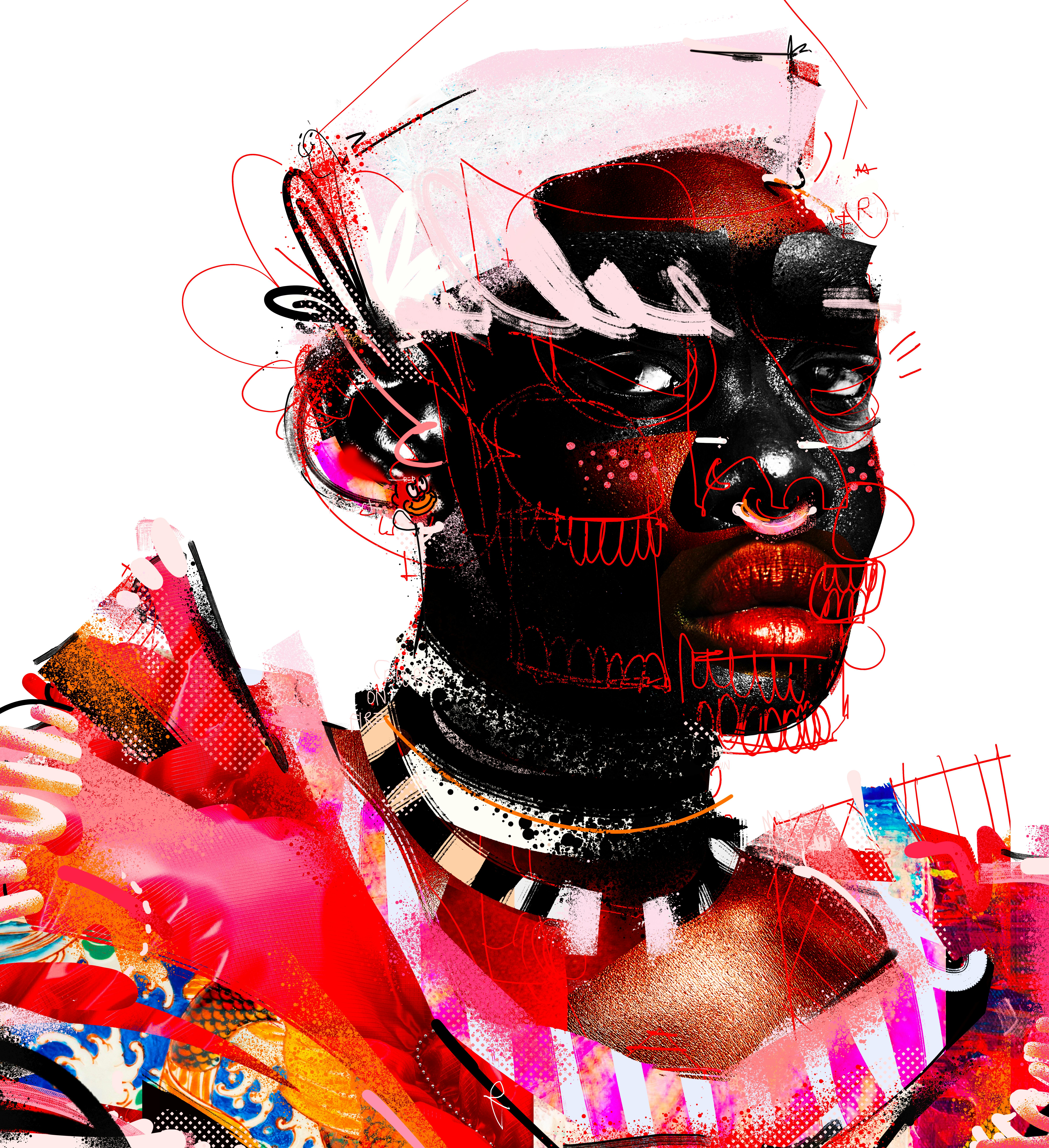
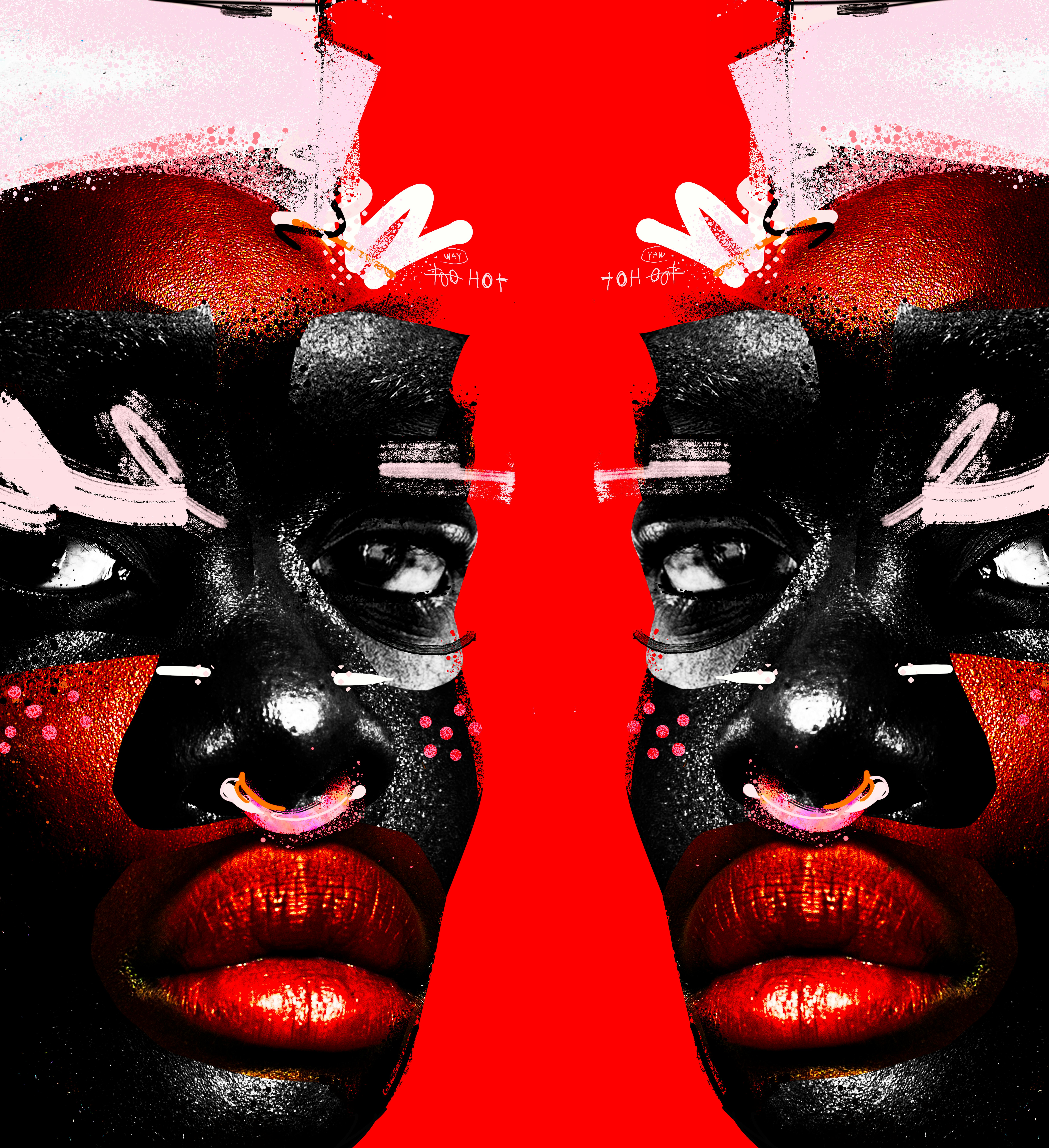
Tasked with an open brief around Summoner's wolf shadow puppet logo, Jess Bianchi created her first ever black and white piece, drawing inspiration from the all-female Japanese manga artist group CLAMP to stage a priestess who summons a demonic wolf.

Mystical elements weave throughout the monochrome narrative, meticulously crafted with assistance from animator Mariana Diaz. Layered with shadow puppetry and morphing bodies, the piece asks where shadow ends and the body begins, with rich textures that feel both ancient and contemporary. The approach paid off. Through skilled attention to silhouette and negative space, the piece casts subtle hints at Summoner's future directions.

Summoner Studio

"We were drawn to Jess' character-driven style and knew it would translate beautifully into our darker aesthetic. The collaboration was a joy – her creativity and craft pushed the project into unexpected and exciting territory.”

Bringing colour to the court.

Berlin: it’s in Josephine Rais’s bones. That’s why she was commissioned to infuse a communal space in the capital with the real spirit of the city.

As part of the Bundesliga Common Ground project, Josephine was called up to revitalise an inner-city football pitch. With creative input from neighbourhood children, she transformed a nondescript space into a bold expression of their vision.

Blending natural elements with urban symbols, Josephine created a simple yet striking portrait of the children’s home: a city alive with colour and contradiction. To capture the complexities of the capital, she played to her strengths and expertly balanced shapes and shades at scale.

The finished product is a testament to Josephine’s talent, Berlin’s rich tapestry and truly unifying effect art has when communities are invited to contribute to their neighbourhood’s aesthetic.

Josephine Rais

“The most rewarding moment was seeing the children play their first match on the finished court. Several parents later reached out to thank me, saying how much more welcoming and exciting the court looks now – which was truly the best feedback I could imagine.”


Juan mixes tenderness and trippiness in KENZO’s animated love story

When KENZO came knocking with the idea to continue the whimsical animated universe from their LUCKY ME collection, Juan was all in.

This second brief, a beautiful, trippy romance. Meet Quique, a tiger with a soft spot for Kali, the rabbit. Their love story doesn’t just stop at stolen glances - it blossoms into a family of three little ones, each carrying the traits of both parents. 

The catch? This had to be a one-shot animation - no cuts, no breaks. Just a seamless visual waltz from start to finish.

Juan R Lage

“I feel the dreamlike tone, the narrative built through transformation, and the characters’ emotional connections all came through just as I envisioned.”

Those transitions became the artist’s signature - fluid, expressive, and tinged with that dreamlike quality that makes the piece feel almost like a moving memory. The challenge was balancing KENZO’s detailed character designs with the demands of fluid animation, all while keeping the tenderness of the story intact.

The results speak for themselves a rich, mysterious nostalgic tone; delicate emotional beats; and a visual rhythm that makes the viewer feel like they’ve stepped into another world. The final piece is more than just an animation. It’s a love story told in a single breath - one that flows, transforms, and lingers long after it ends.

Creative Lead: Julien Gaullet
Clean-up Artist: Juli Soloaga
Production: The Different Folk
Client: Kenzo

Juan R Lage

“I’m proud we kept the one-shot structure. It’s full of camera shifts and intricate transformations, but we didn’t lose any detail. Everything - the atmosphere, the characters’ connections, the dreamlike flow - came out exactly as I’d hoped.”

Turning characters into characters.

From the weird to the whimsical, Aleks Bokova creates worlds brimming with wonder – and Kilotype wanted one for its brand new typeface

For Aleks, Plastique was more than just a font. It was another chance to prove the power of personification. It was about bringing a brand to life, infusing its product with personality and designing a world entirely of its own.

Putting a pencil in the hands of her inner child, she developed a playground of colourful 3D characters. Experimenting with textures, lighting and materials, the skilled animator produced a series of spirited characters, complete with individual traits and temperament, for the award-winning type publisher.

Kilotype’s brief allowed Aleks to follow her artistic instincts – to the letter. Playing to her strengths, she produced a striking showcase of shapes that tests the limits of the imagination.


Aleksandra Bokova

The magic came from bringing all those colourful shapes to life, and treating each letter as if it had its own personality. I wanted the letters and toys to feel like characters in this playful little universe, each adding to the sense of wonder. “


French bulldogs, and vinyasana's. Rew brings an elevated calm to Fintech company Koto's brand.

Most fintech visuals consist of technical illustrations or abstract iconography. It’s why Canadian fintech company KOHO’s latest art direction in choosing Rew is so refreshing. The platform’s imagery being brought to life in vivid shades, sunset vistas and sunbathing French bulldogs. Giving Rew creative freedom to develop real-world characters in work and at rest – free rein to push its art direction beyond the typical confines.

The platform’s imagery being brought to life in vivid shades, sunset vistas and sunbathing French bulldogs. Giving Rew creative freedom to develop real-world characters in work and at rest – free rein to push its art direction beyond the typical confines.

The exciting part is the range of characters that make sense in the KOHO world – from a guy relaxing in the park with his beloved pooch, the series also included a barista, a nurse, a chef and an animated gif of a yogi perfecting her pose in the dwindling sunlight.

The exciting part is the range of characters that make sense in the KOHO world – from a guy relaxing in the park with his beloved pooch, the series also included a barista, a nurse, a chef and an animated gif of a yogi perfecting her pose in the dwindling sunlight.

Rew

"Trying to keep a colour palette through different times of the day, and changing the light was new for me"

A feast for the eyes

Fashion giant Breuninger's annual Fashion x Food event in Stuttgart needed a visual language to link couture and cuisine. Known for reimagining worlds with bold colour palettes and mastery of pastel, TDF’s Josephine Rai was the perfect ingredient.

Using the concept “Taste the Flair,” and taking cues from Alice in Wonderland, Josephine conjured up a surreal world of elaborate cakes, cascading pearls, and wine glasses so large you could swim in them. Our favourite? The woman riding a life-sized lobster in bright pink cowboy boots.

Mixing Breuninger's signature red with her distinctive colour palette, Josephine’s artwork was the perfect backdrop for an evening of live cooking, with a lineup of Michelin-starred TV chefs.

You could say – she ate.

Josephine Rais

“For me, fashion and food go really well together. Personally, I love to go out for dinner and I love to dress up for that special occasion”.

Juan Molinet adds retro fizz to Coca-Cola’s eco campaign

Blending bold colours, playful shapes, and 90s flair, Juan brings his signature pop to the latest phase of Coke Reborn—celebrating a greener future with a nostalgic twist.

For the latest phase of Coke Reborn, its campaign promoting a greener world, Coca-Cola wanted a style that truly pops. Heavily inspired by the branding of his youth, Juan Molinet is known for putting an old-school spin on present-day packaging – and Coca-Cola wanted in.

Blending his trademark aesthetic with the brand’s global identity, Juan’s creative was an effervescent take on the company’s eco-friendly values

Juan Molinet

“I leaned into what I love – bold colours, playful shapes, and a lot of movement and energy in the compositions.”

When Korean skincare brand Yepoda set out to create their Pride Edition of their cult-favorite toner mist, they knew it had to be more than just skincare. 

Josephine Rais, whose work bursts with bold colors, playful energy, and unapologetic joy was the instant choice. 


For this limited edition, 100% of the profits go directly to LGBTQIA+ causes - meaning every spritz supports a community that Yepoda proudly stands behind. Josephine’s packaging design turns the mist bottle into a mini canvas: vibrant, expressive, and impossible to ignore.

Symbolism drawn into every detail: flags woven into clothing & makeup, hearts as a symbol of love & figures blending across the gender spectrum.  “Beauty is subjective - my goal was inclusivity. A wide range of people, all seeing their own version of beauty" Josephine adds. The impact - a sold out collections and €40,000 raised for LGBTQ+ organisations.

Josephine Rais

I wanted to make love visible — celebrating joy, queerness and self-care that reflects how Gen Z experiences and expresses themselves.